7TH STREET CASINO
PROJECT
7th Street Casino hired an agency to help refresh its visual identity. However, since their content resulted in segmented/incohesive work, I proposed a compromise: to take their strongest visual elements and weave them into a new system that's unified and polished, yet fun/approachable for a casual casino audience.
PROCESS
I started by analyzing the agency's guide, which contained a variety of different assets, all very different/unrelated and required to use in specific instances. Although there's nothing wrong with restricting certain aesthetics for certain situations, if elements are so different/unrelated to each other, then the consumer's retention of the brand becomes diluted. Again, is for this reason the identity needed significant overlap and unity.
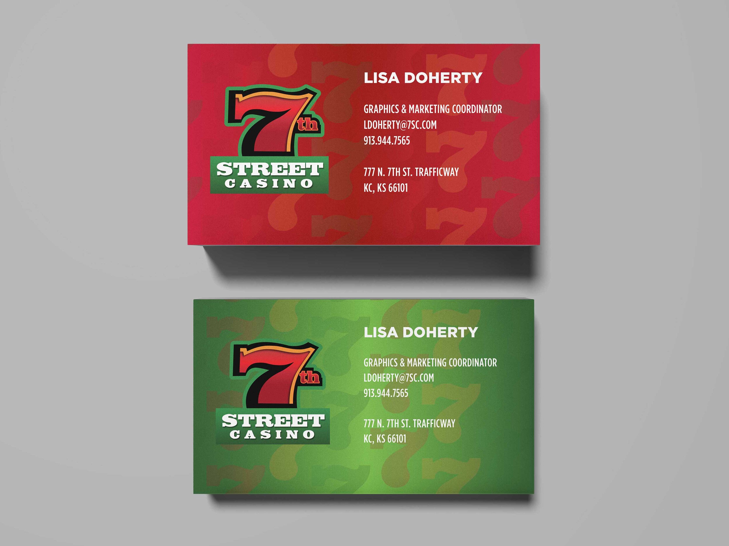
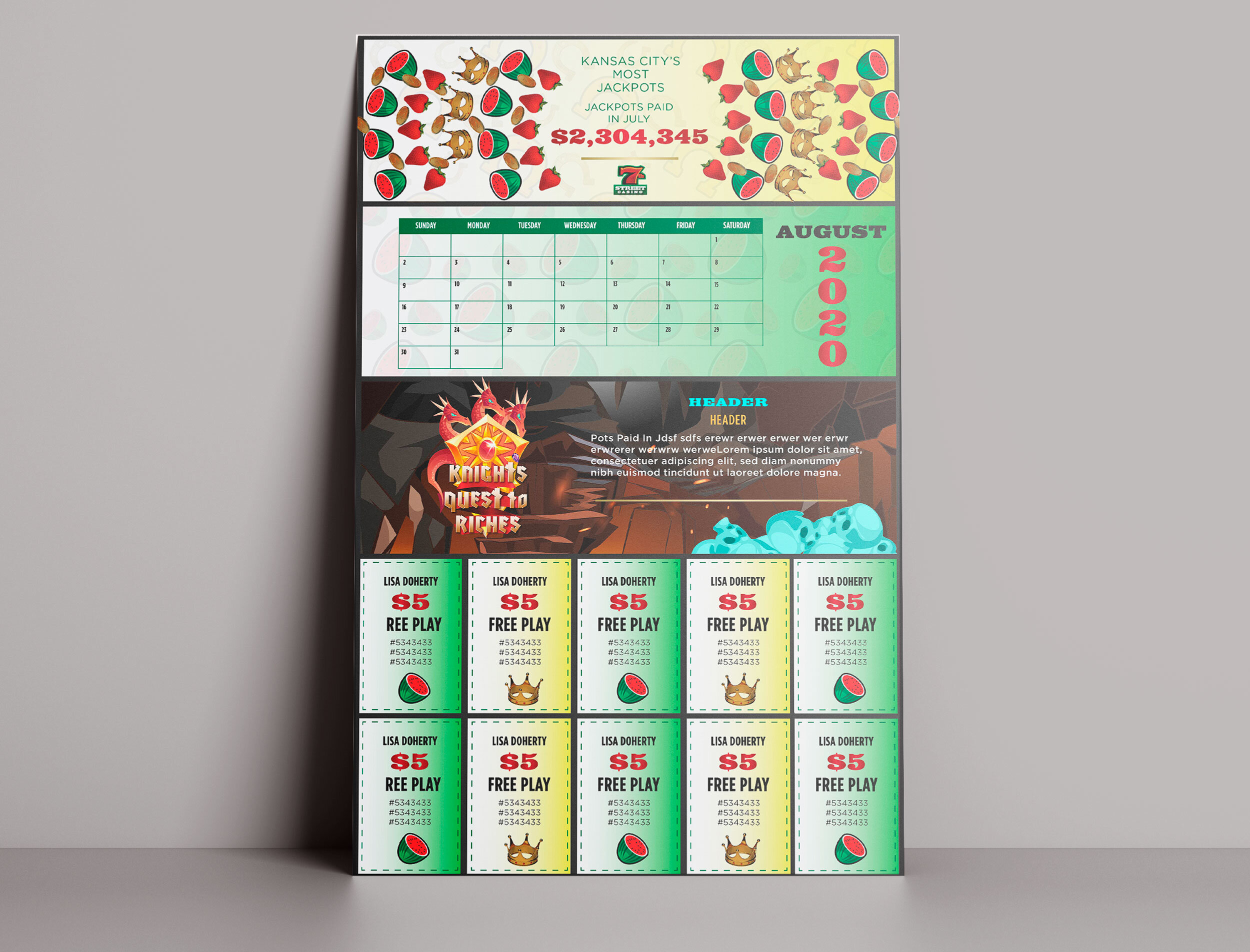
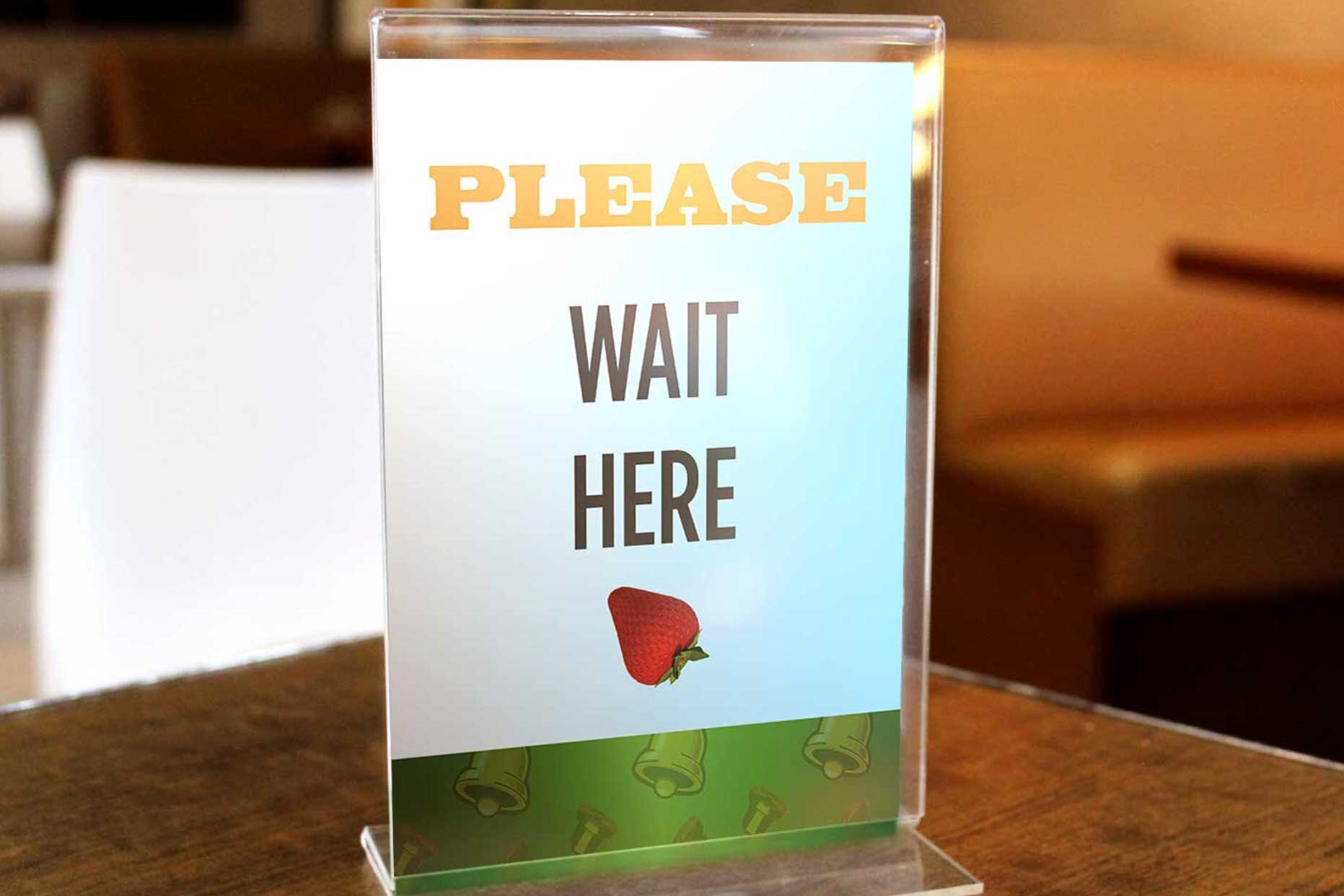
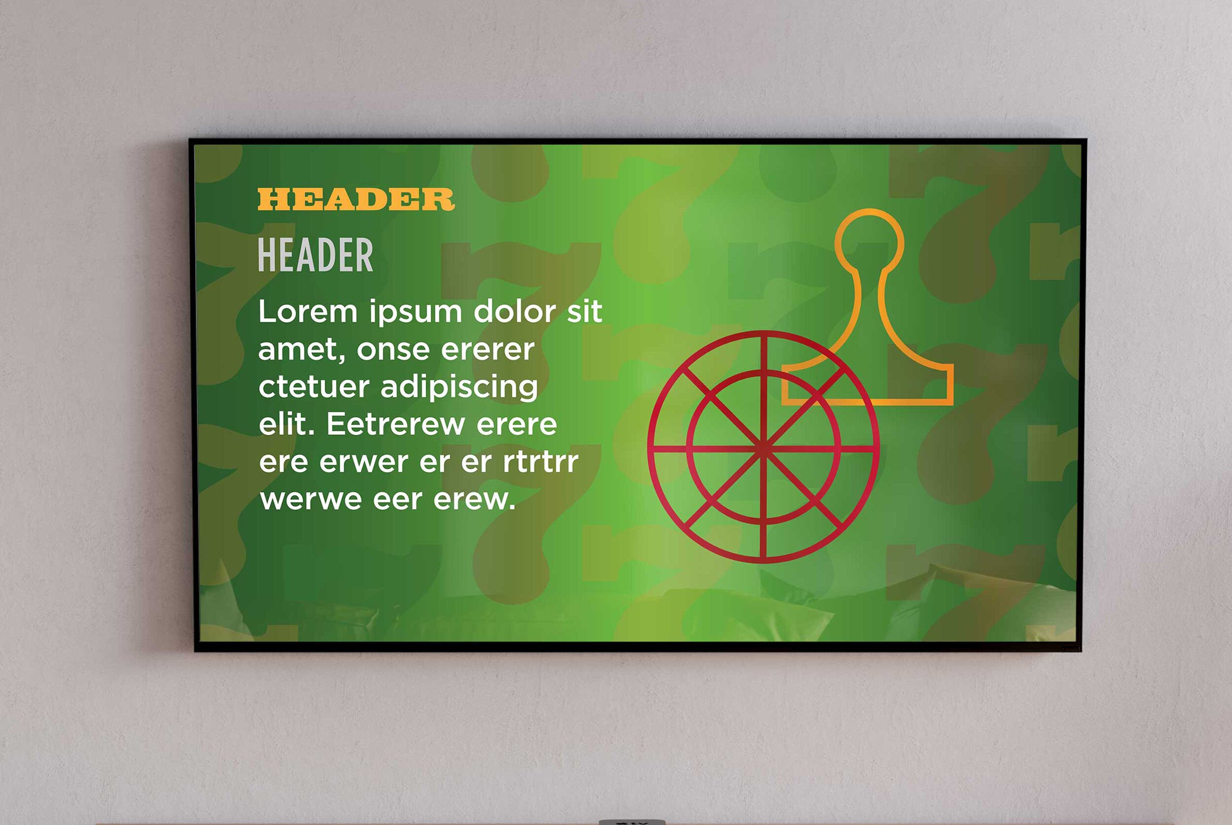
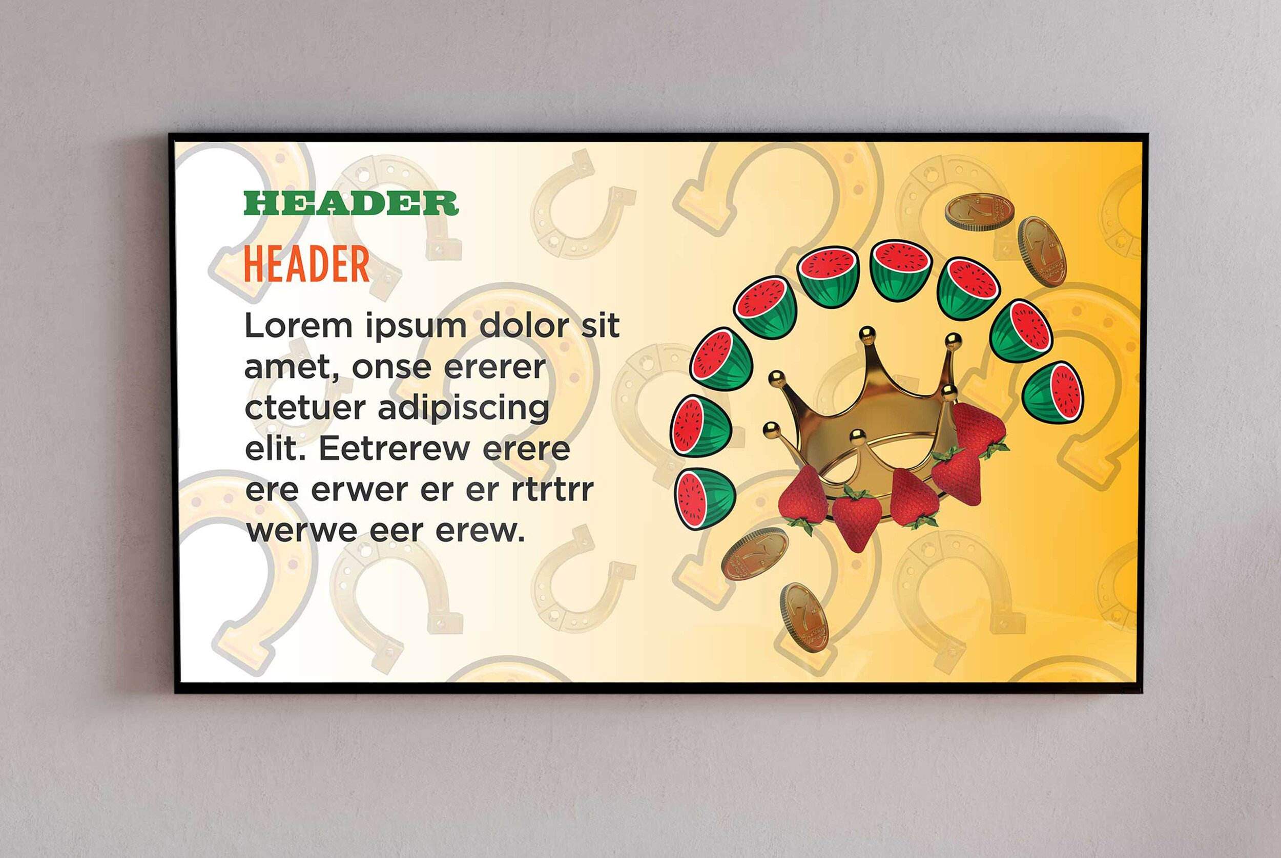
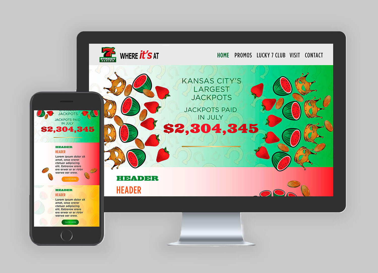
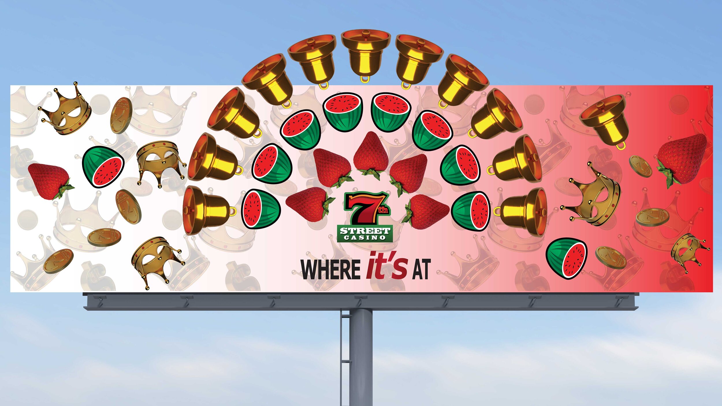
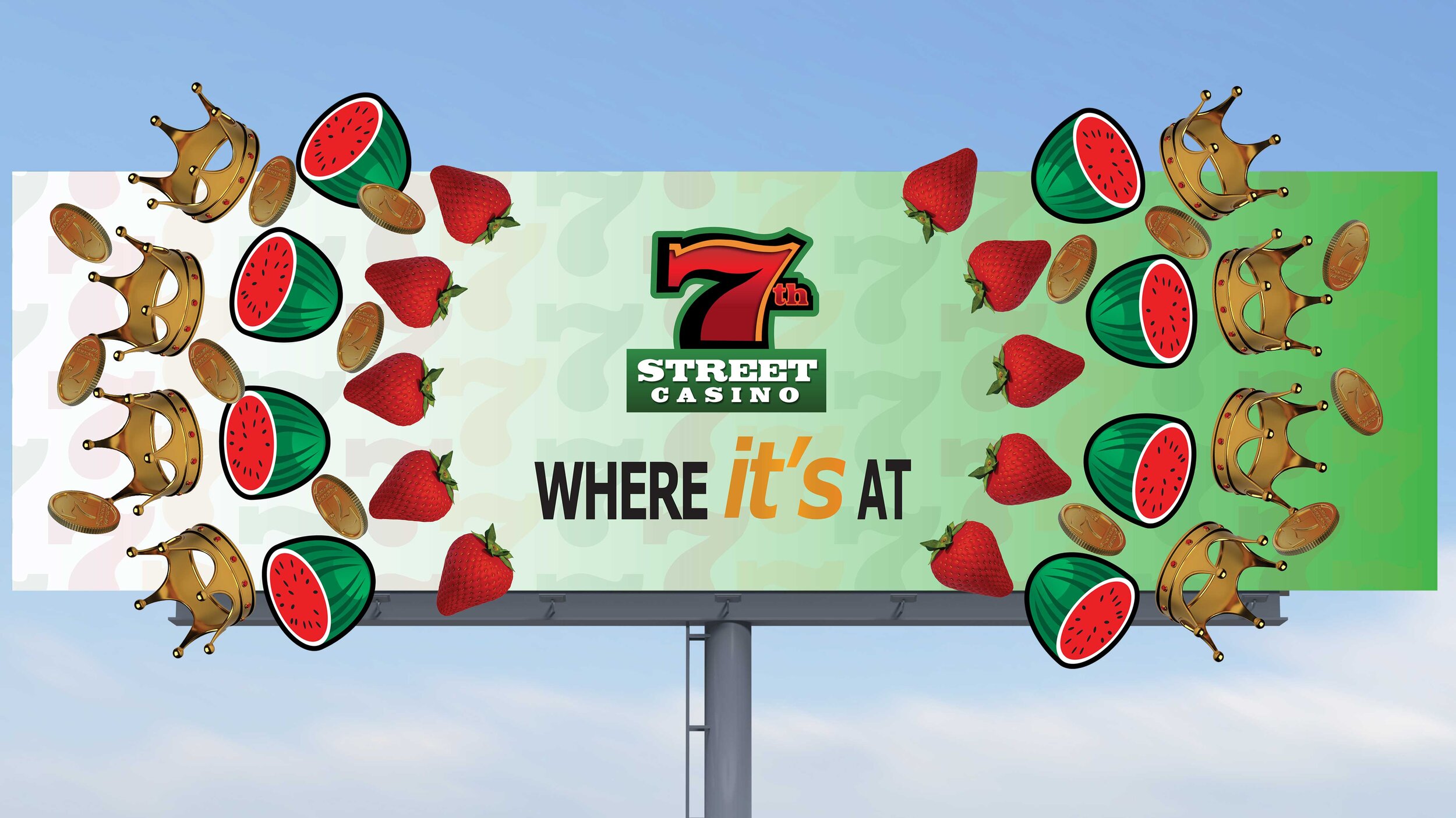
1) After reviewing this guide, I filtered elements to the strongest/pragmatic; specifically two types of slot symbols: one that is more traditional/iconic and another that was 3-D/had a modern twist and thought: how could I combine these to create something fresh/distinct from its generic casino competitors?
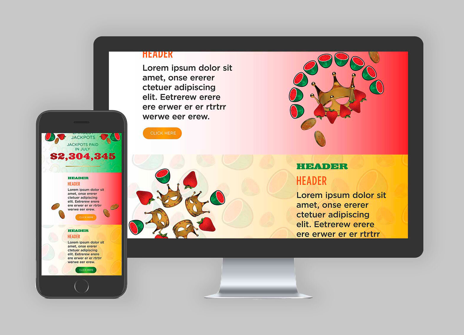
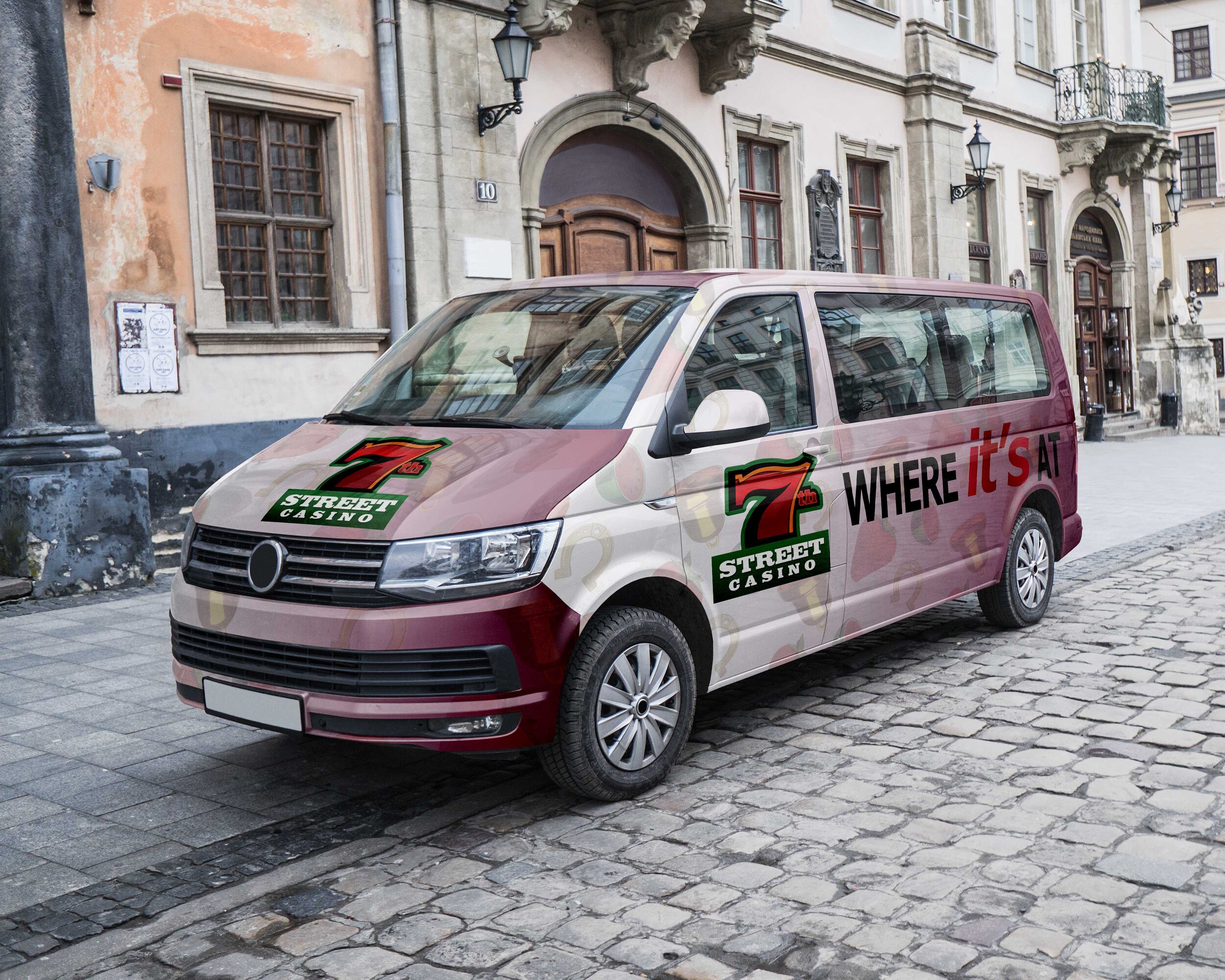
2) Liking the effect of combining these elements, I created a system with several playful patterns within the casino's existing color palette/gradients and classic typography.
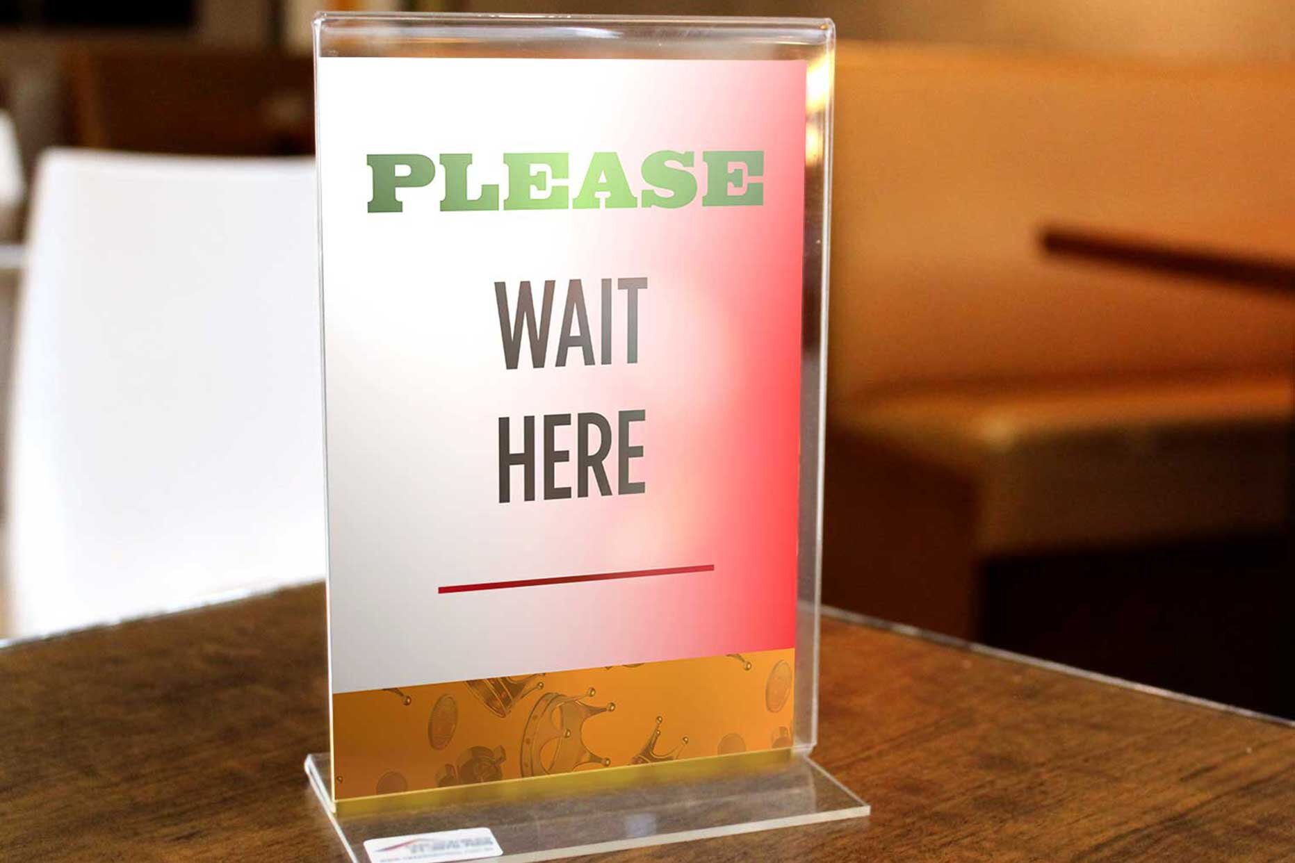
3) Once I established this small system and being familiar with the property signage, I created sketches to confirm composition/concepts, and executed and presented it in the form of a mockup series.