DA MAGAZINE
PROJECT
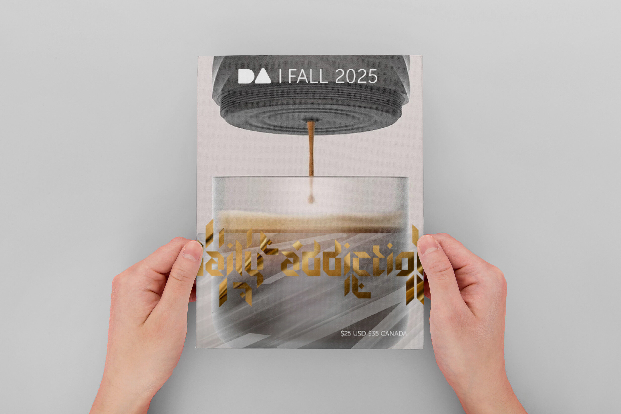
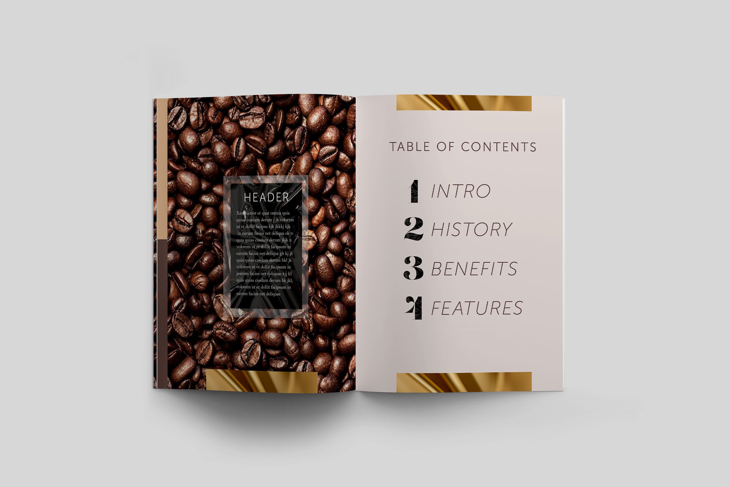
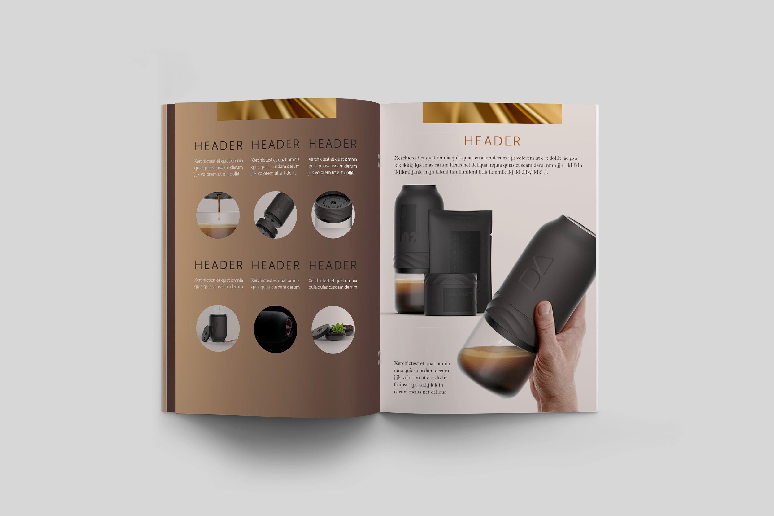
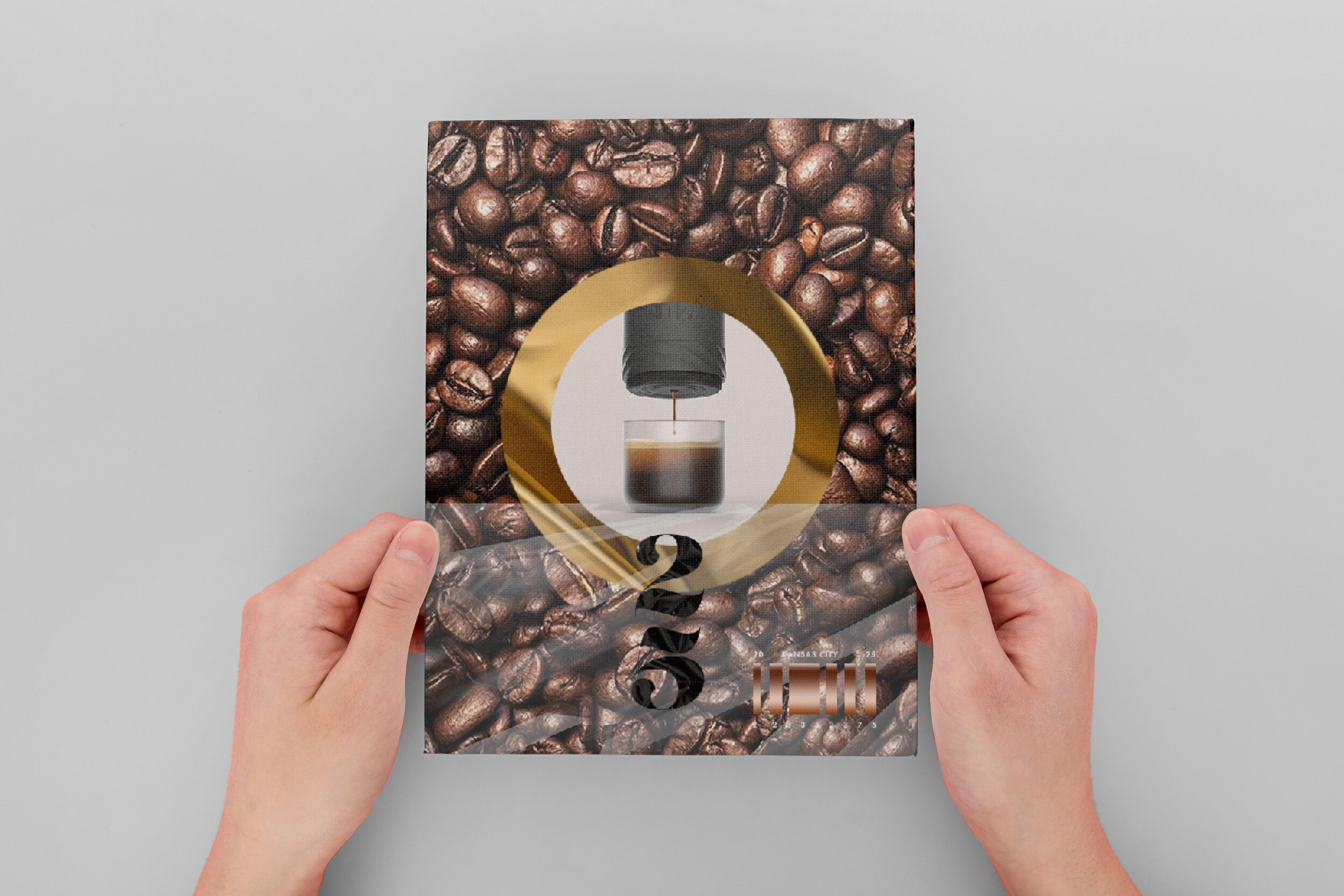
The magazine started as a layout exercise and was later revisited/rehauled. As a retail catalog for a coffee appliance, I challenged myself to market it for a futuristic period and high-income audience.
PROCESS
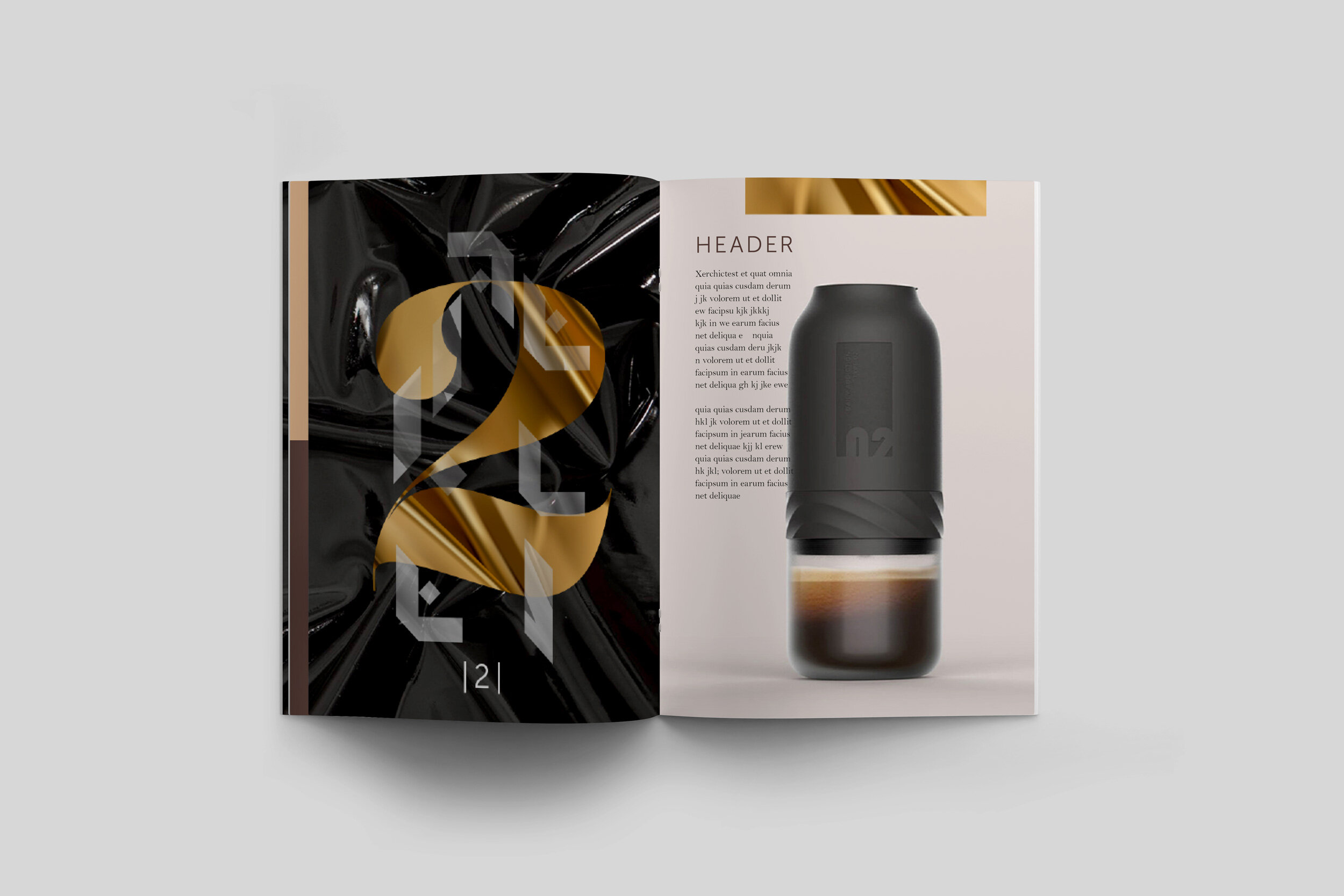
Once I discovered updated product photography, I considered the mood/tone of the catalog. Although I put a futuristic spin on the catalog, was important to address: what sort of future? Most sci-fi depictions tend to be exaggerated or go cyberpunk; sometimes with splashes of Asian symbols...but I try to avoid the cliche so designed something more approachable and thus realistic. Given this and the high cost of the item/income level, felt a luxurious typeface with glossy textures was also smart since it'd complement the pastel color palette of the photos.
Photography courtesy of Mii Studio.