DMS 1
PROJECT
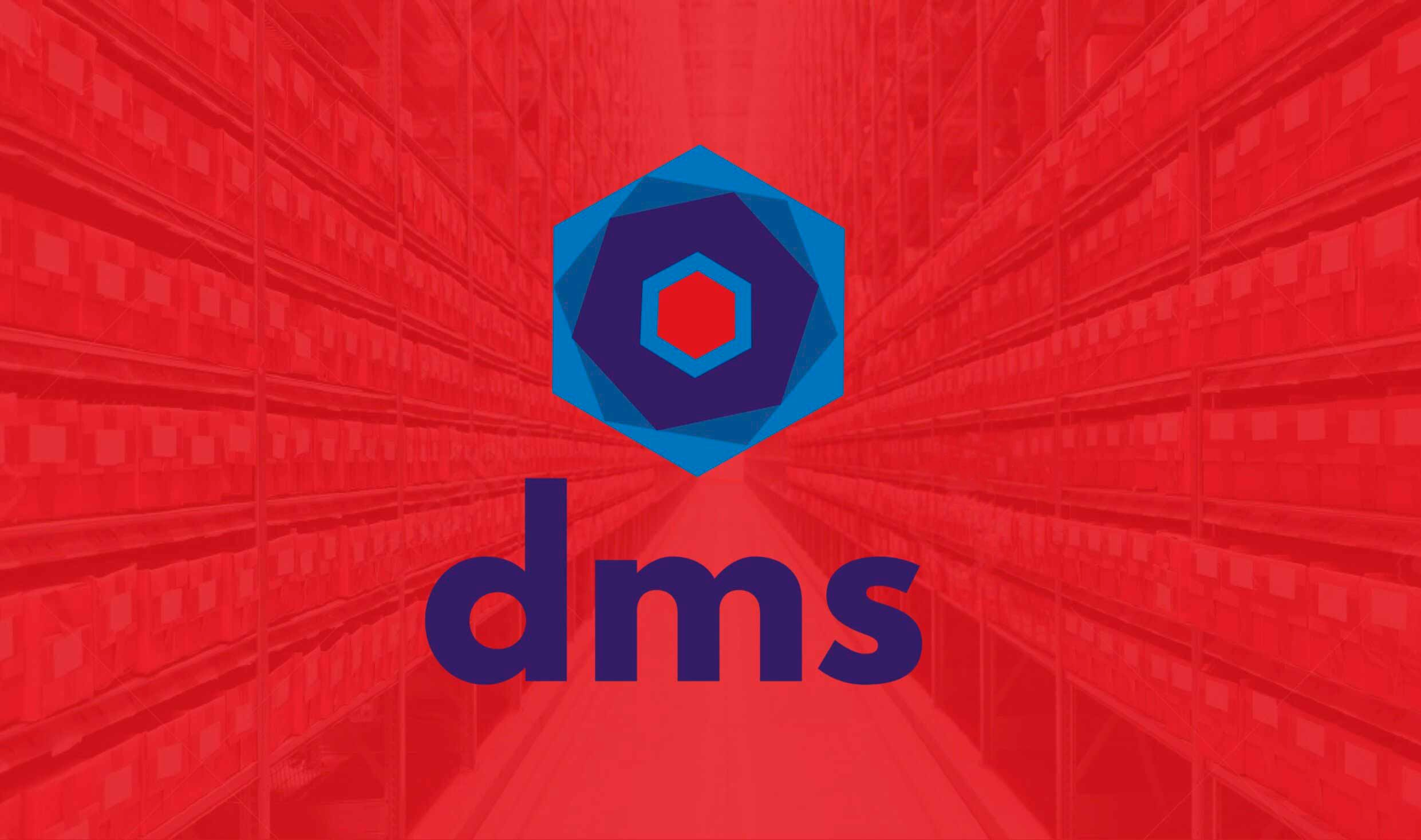
DMS was a Kansas City record-storage facility that archived sensitive content and whose main competitor was a large international company. Since DMS prides itself on trust, quality, and detail orientation in all aspects of information management, I suggested developing a visual identity that would better reflect this to attract its corporate audiences and distinguish itself from its competitors.
PROCESS
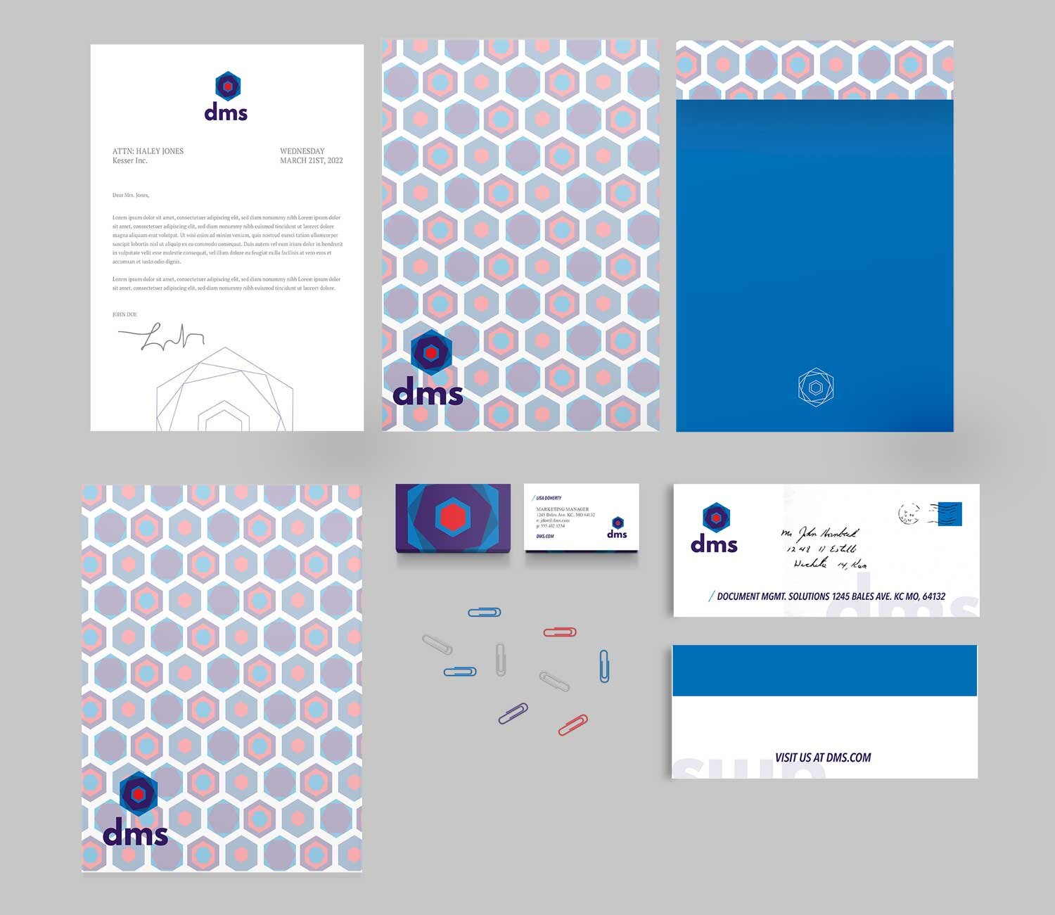
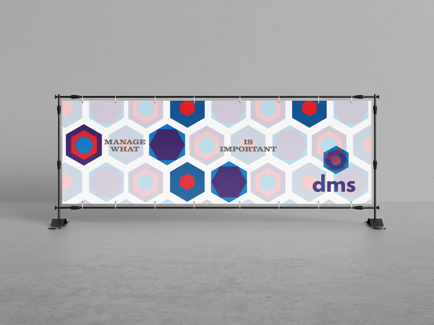
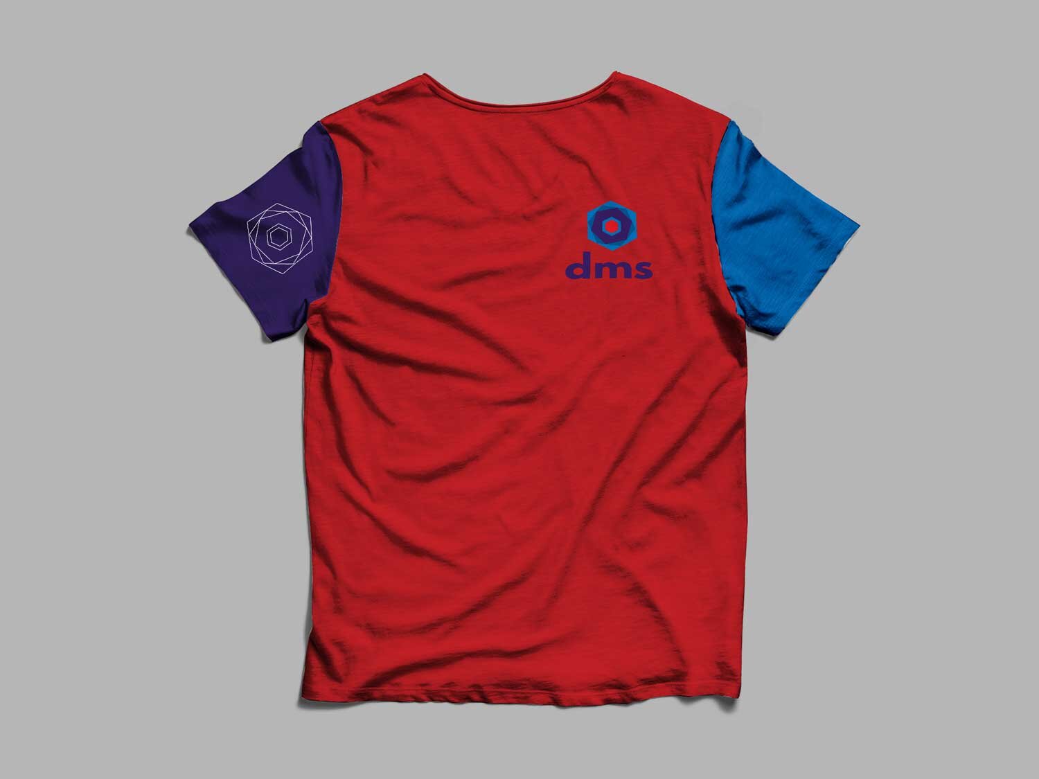
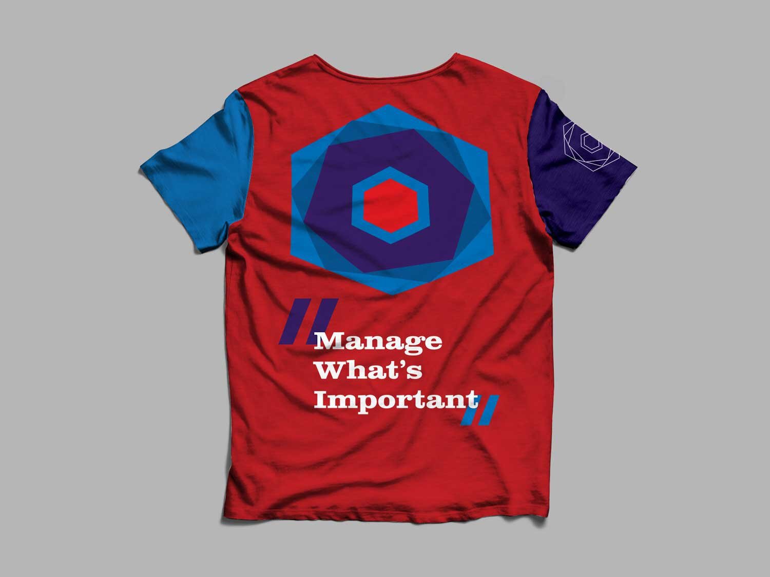
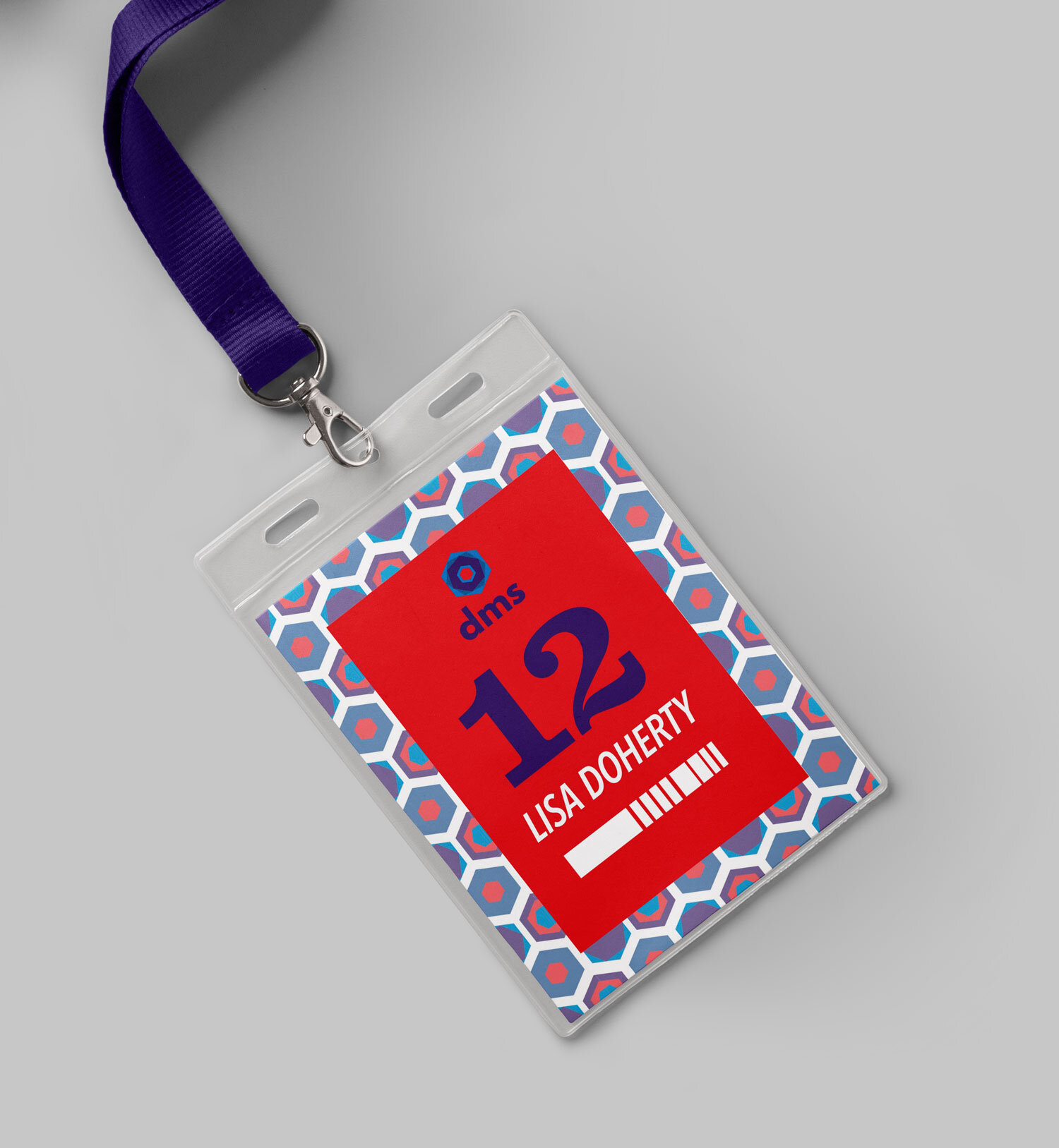
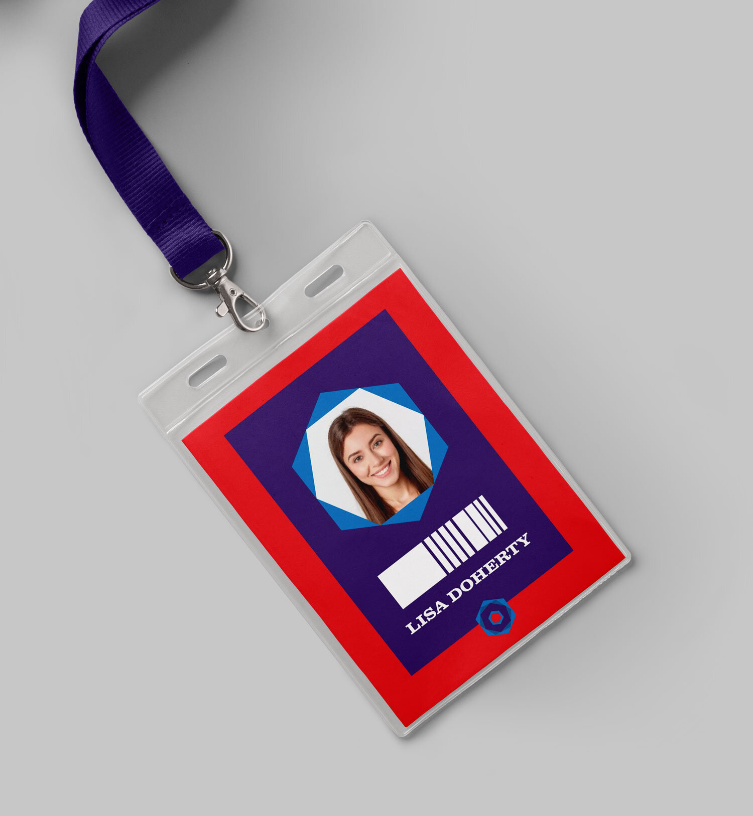
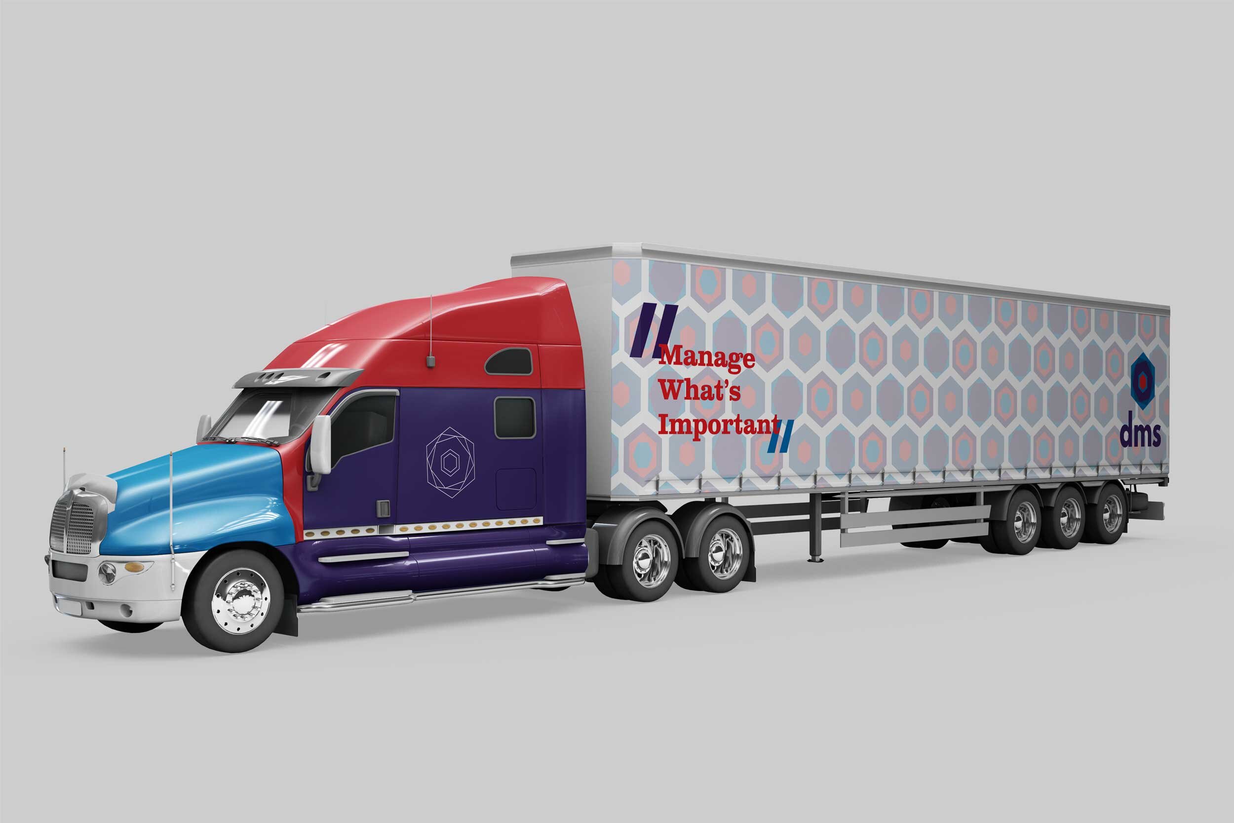
After distilling basic background elements, I kept the image sleek to mimic their targeted corporate audience. Next, I centered the logo and thus the identity around a hexagon motif, given the qualities of the shape that mimic a 3-D box, the inner rotations that suggest storage/security, and detail orientation at its core. Last I echoed and saturated their former color scheme for a modern finish. I altered these by creating vibrant blues to denote trust/stability/security, purple to denote high quality/wisdom, and a splash of red to suggest the urgency of sensitive content at its center.
When I later revisited and expanded this identity, I supplemented these elements with a couple of commonplace items, which were symbolic of quality services like personable customer service, strategy, and security.