DMS 2
PROJECT
DMS was a Kansas City record-storage facility that archived sensitive content and whose main competitor was a large international company. Since DMS prides itself on trust, quality, and detail orientation in all aspects of information management, I suggested developing an identity that would better reflect this to attract its corporate audiences and distinguish itself from its competitors.
PROCESS
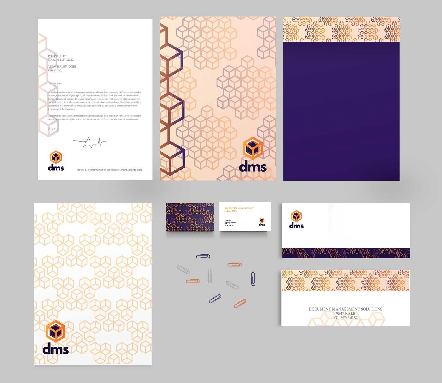
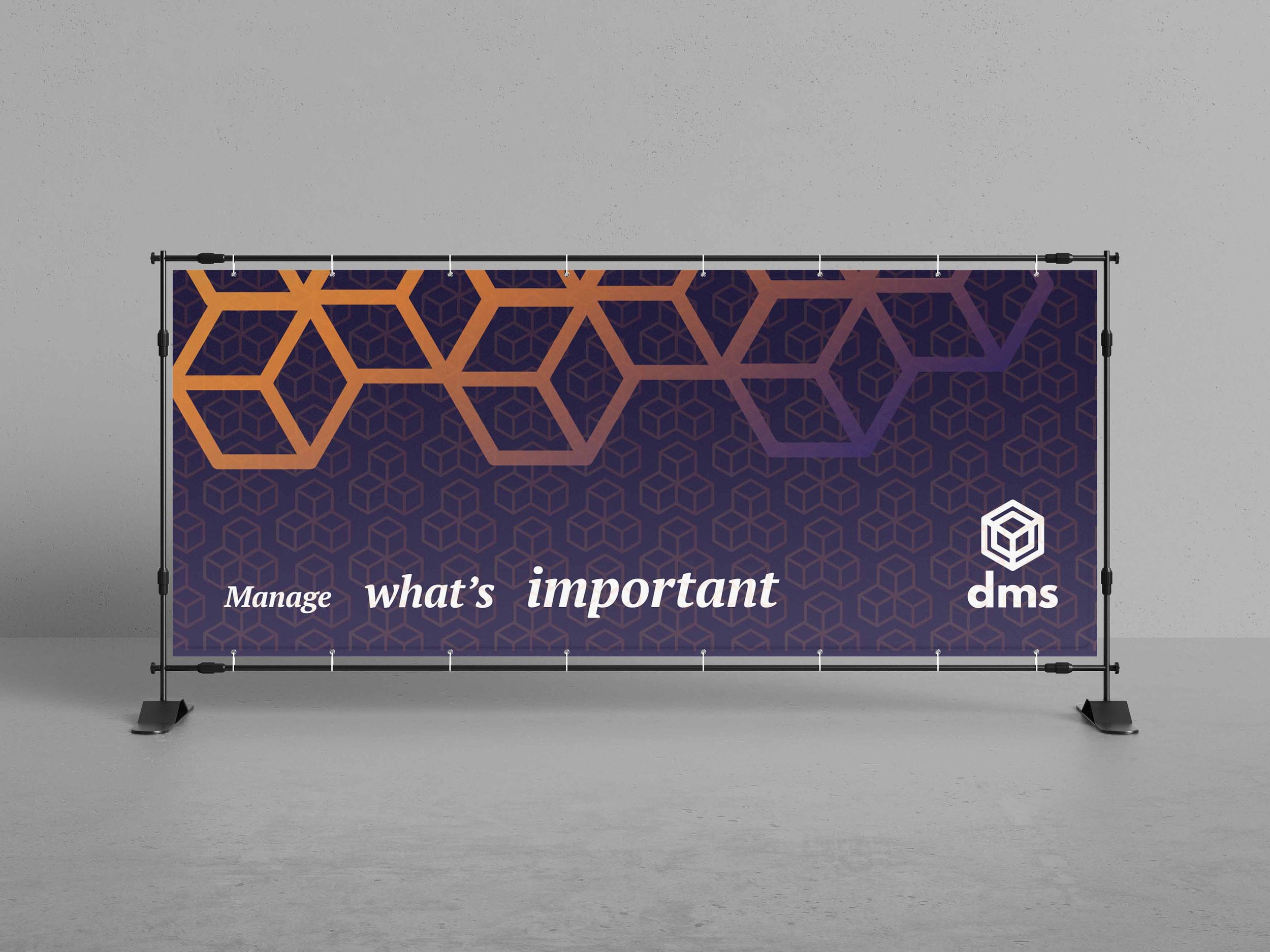
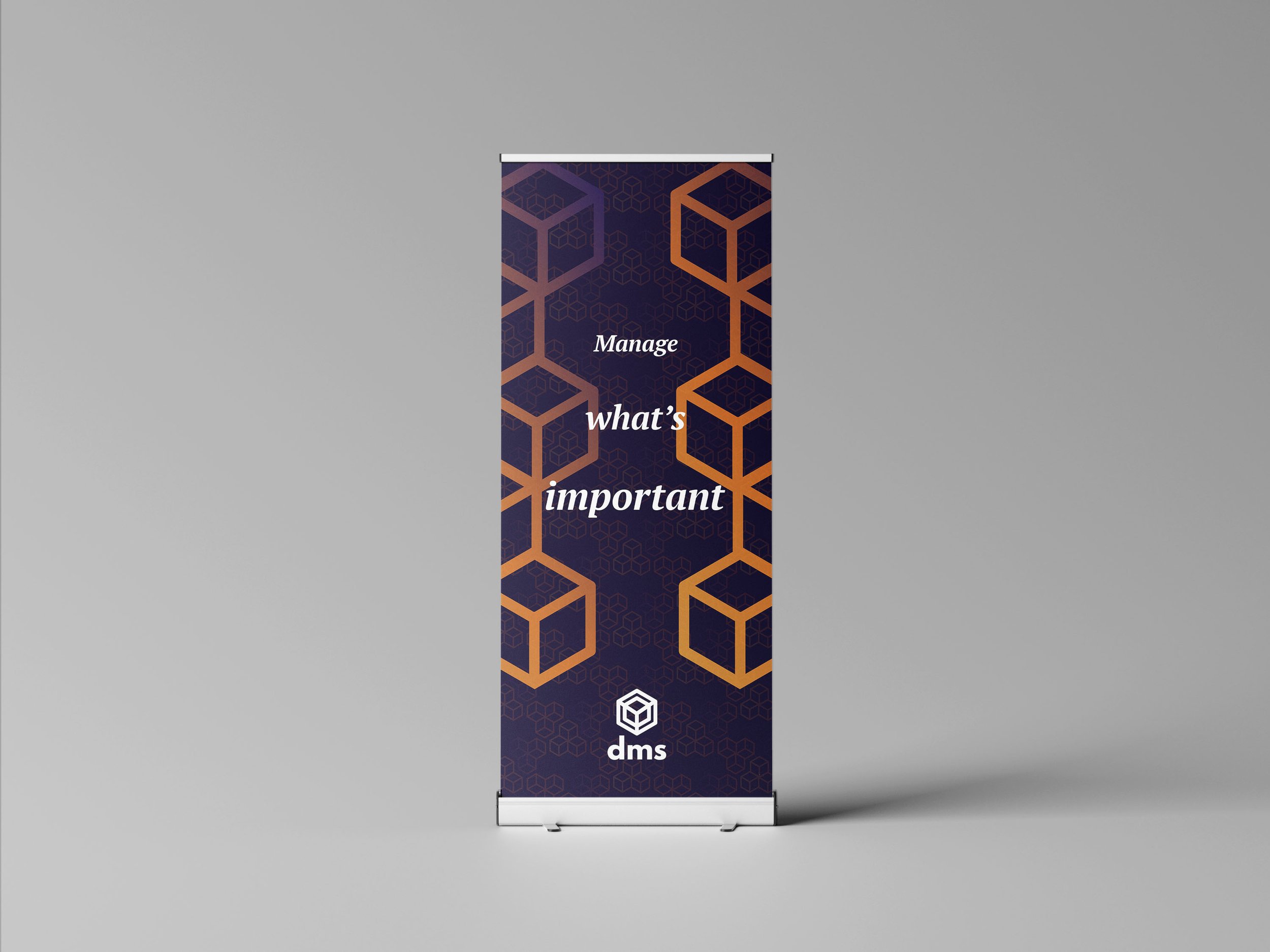
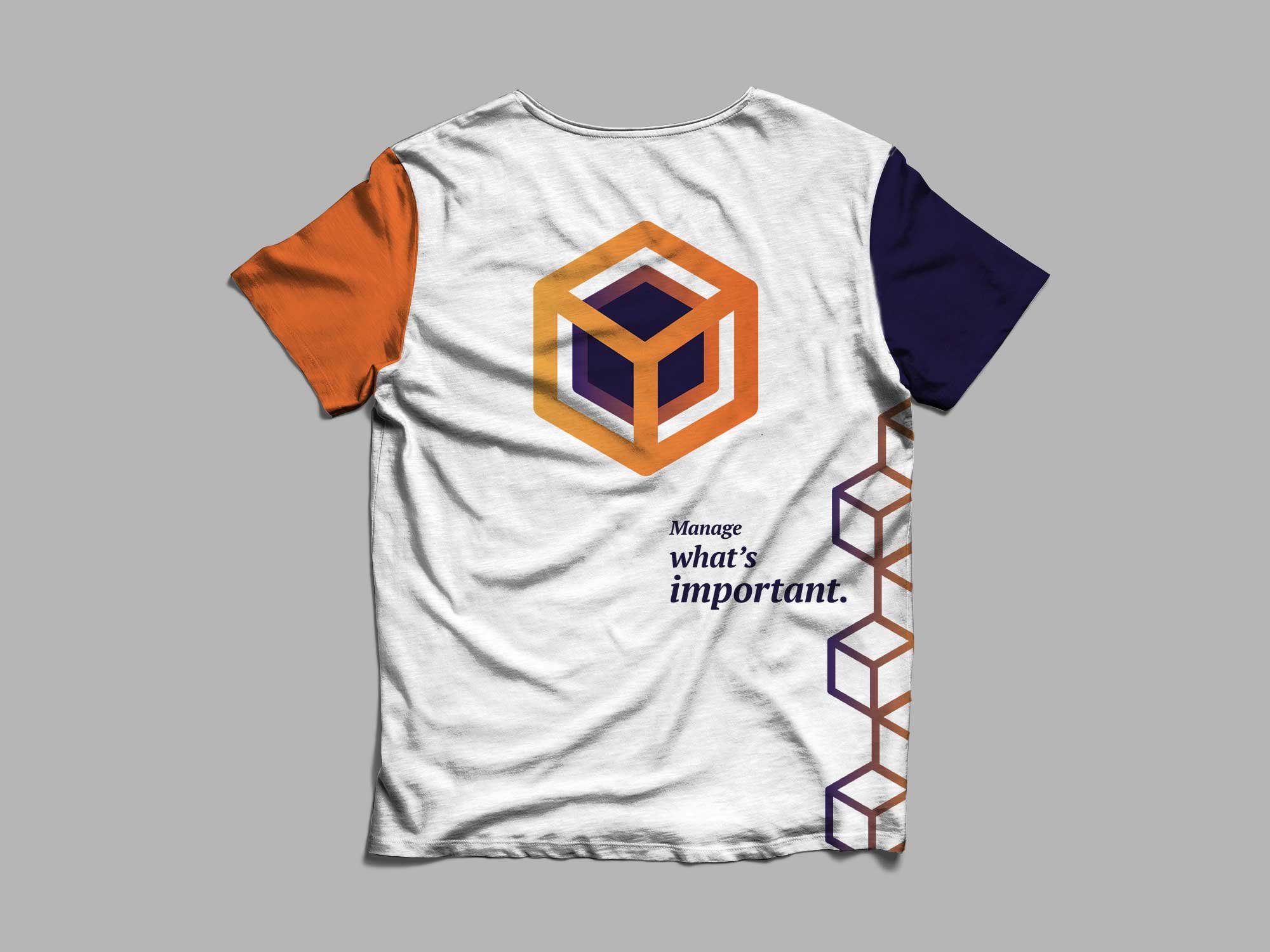
After distilling basic background elements, I kept the image sleek to mimic their targeted corporate audience. Next, I centered the logo and thus the identity around a hexagon motif, given the qualities of the shape that mimic a 3-D box, the inner rotations that suggest storage/security, and the detail orientation at its core. Last finished with a saturated color scheme including purple to denote high quality/wisdom and a variety of oranges associated with industrialism. The following is a second proposed identity system.