HOMEBASE HARDWARE
PROJECT
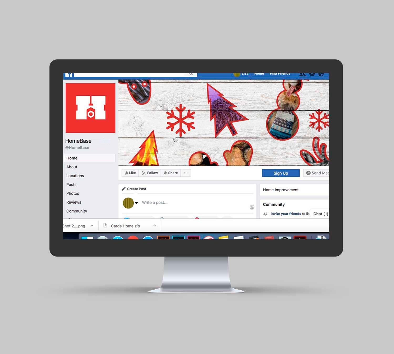
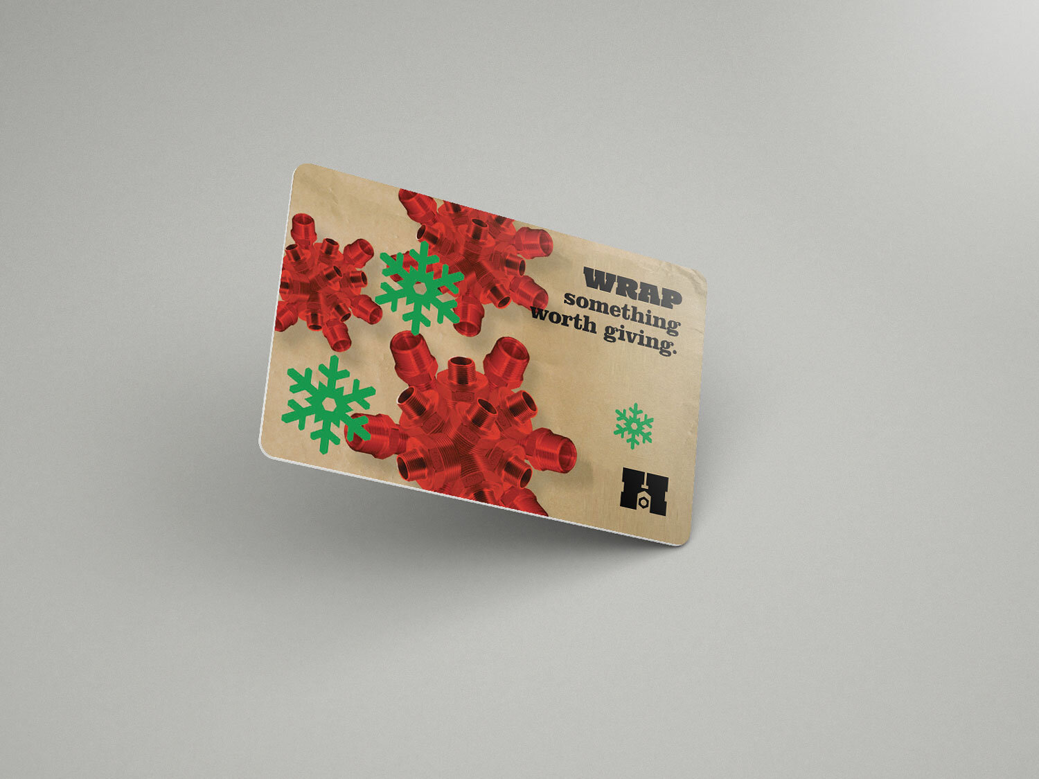
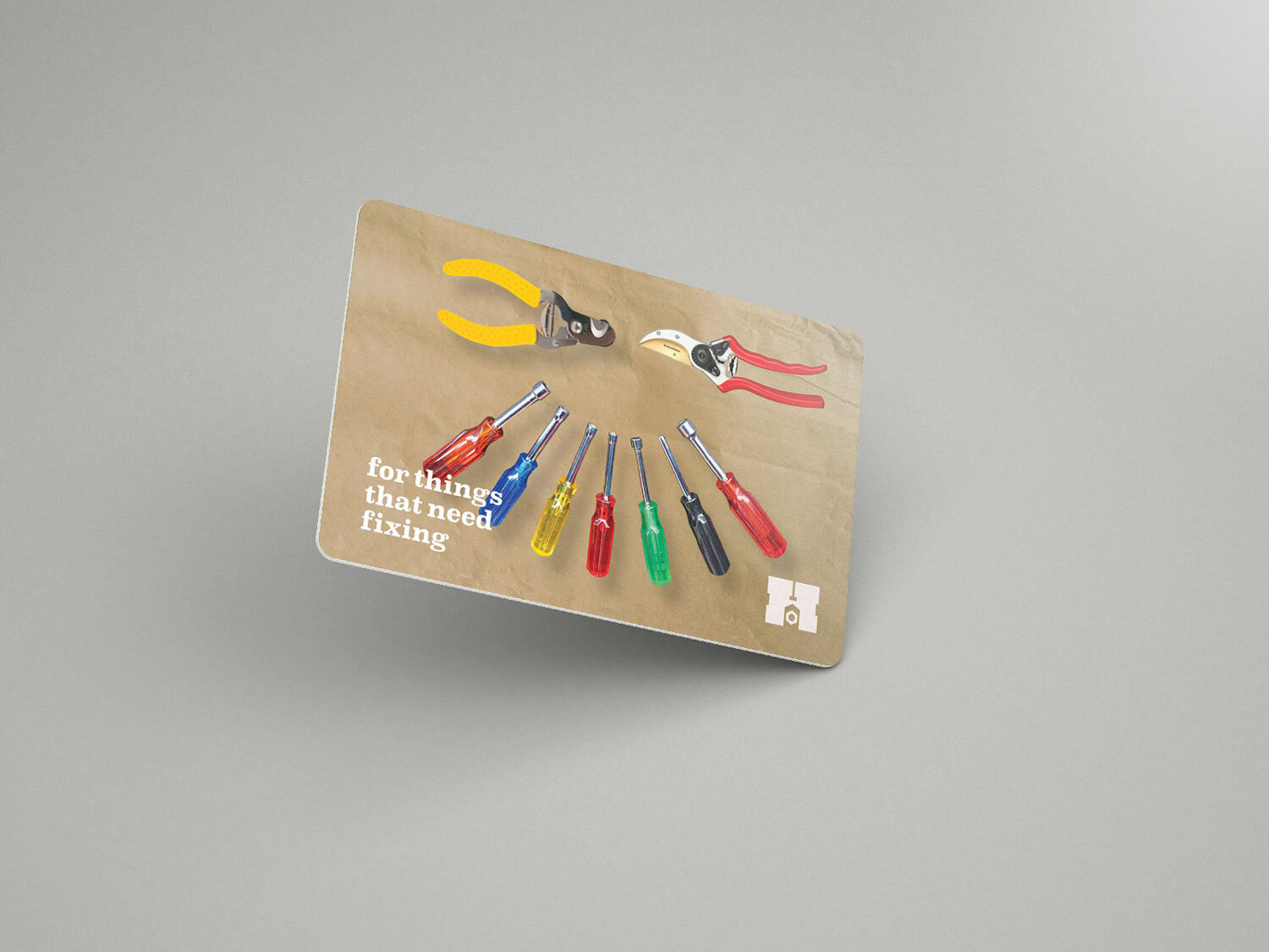
Part of a passion project related to a former employer that was later developed into a full identity reflecting various mediums that were actually used by the company (e.g. a storefront, gift cards, a social page, retail catalog, etc.).
PROCESS
Before addressing any identity project, my focus always starts with the audience: who's the customer and what's important to them? Since the chain hinges on affordability, it makes sense its audience is mostly young singles, families on a budget, blue-collar workers/etc. Given these approachable and affordable visual constraints, IKEA sprang to mind.
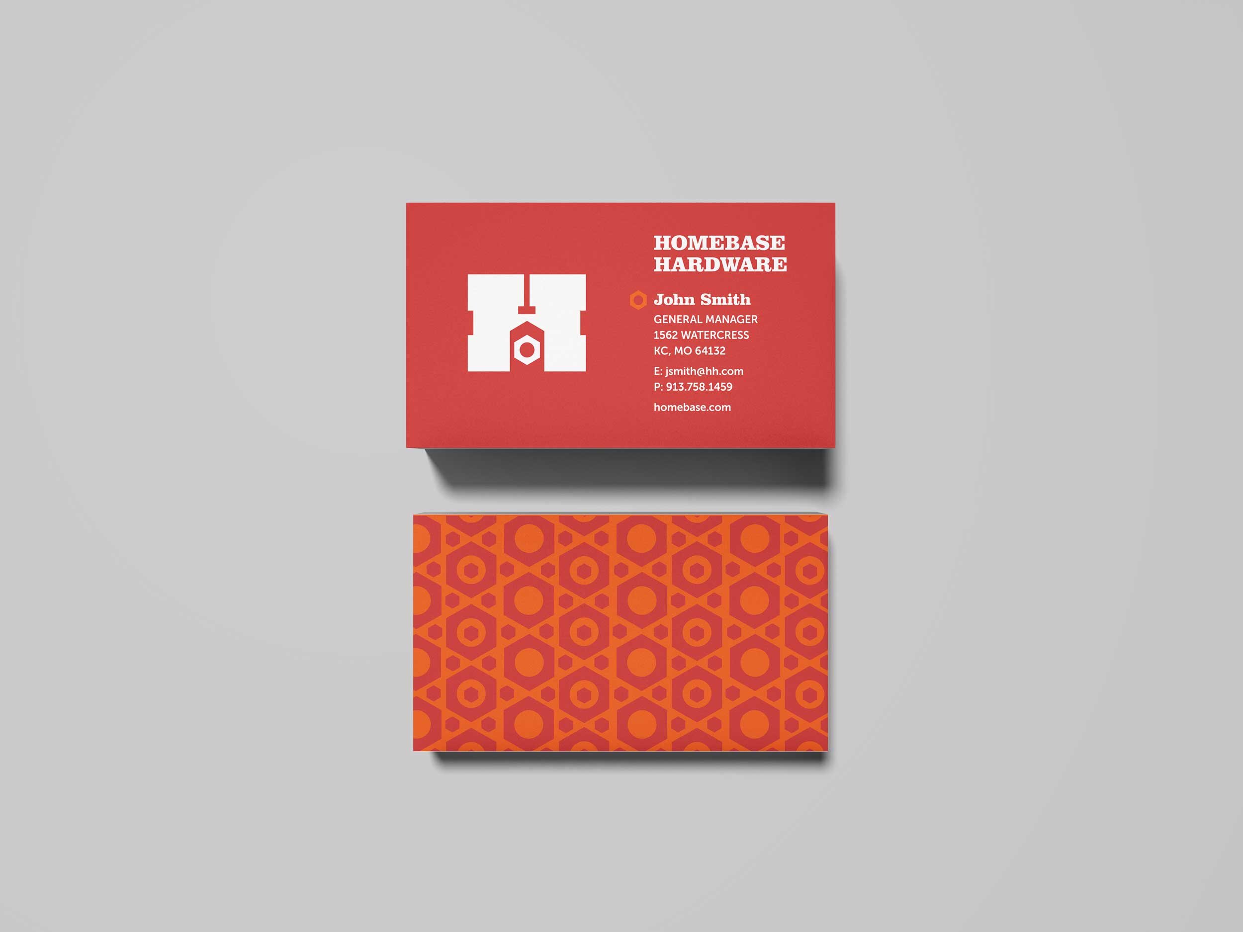
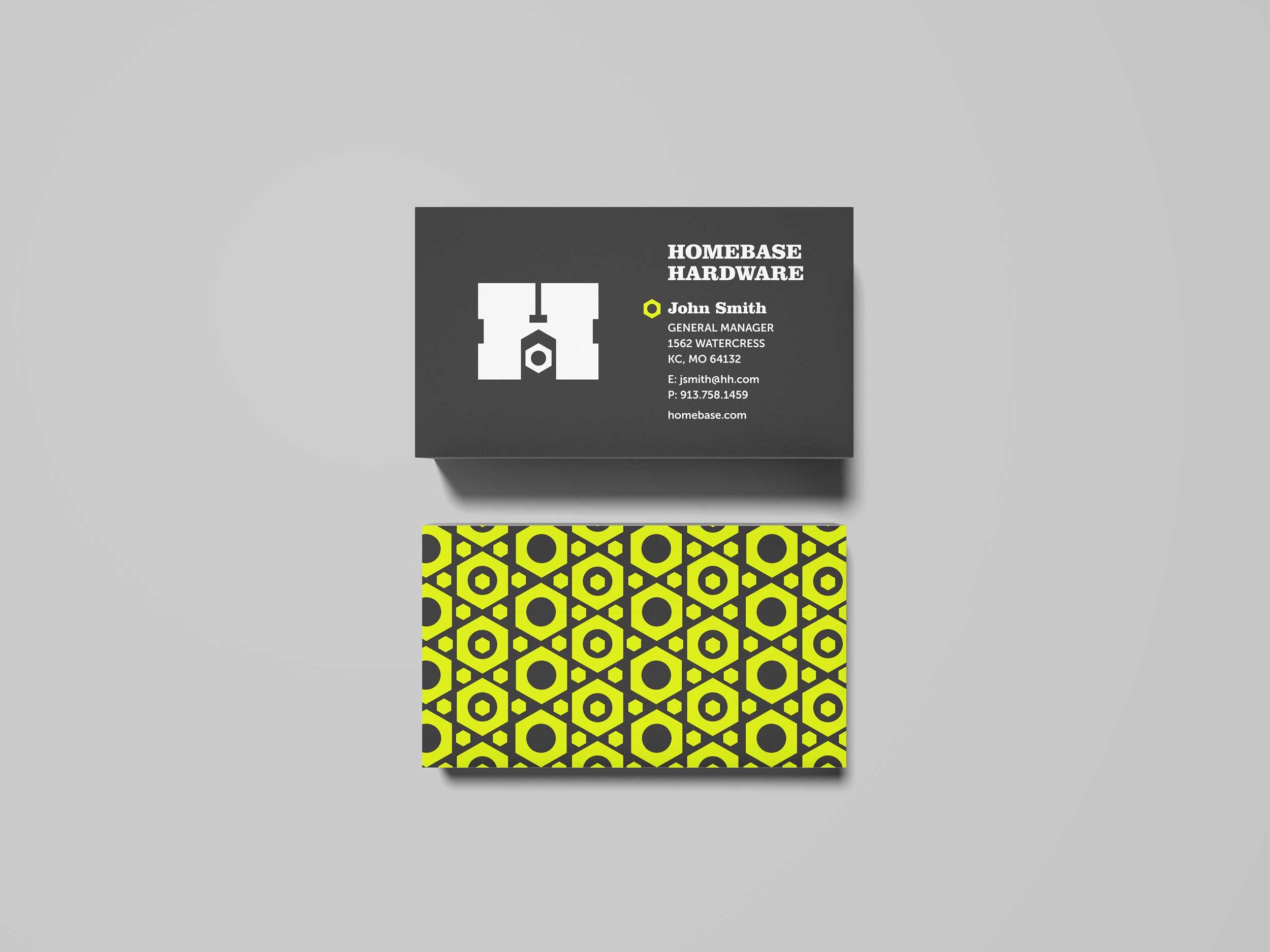
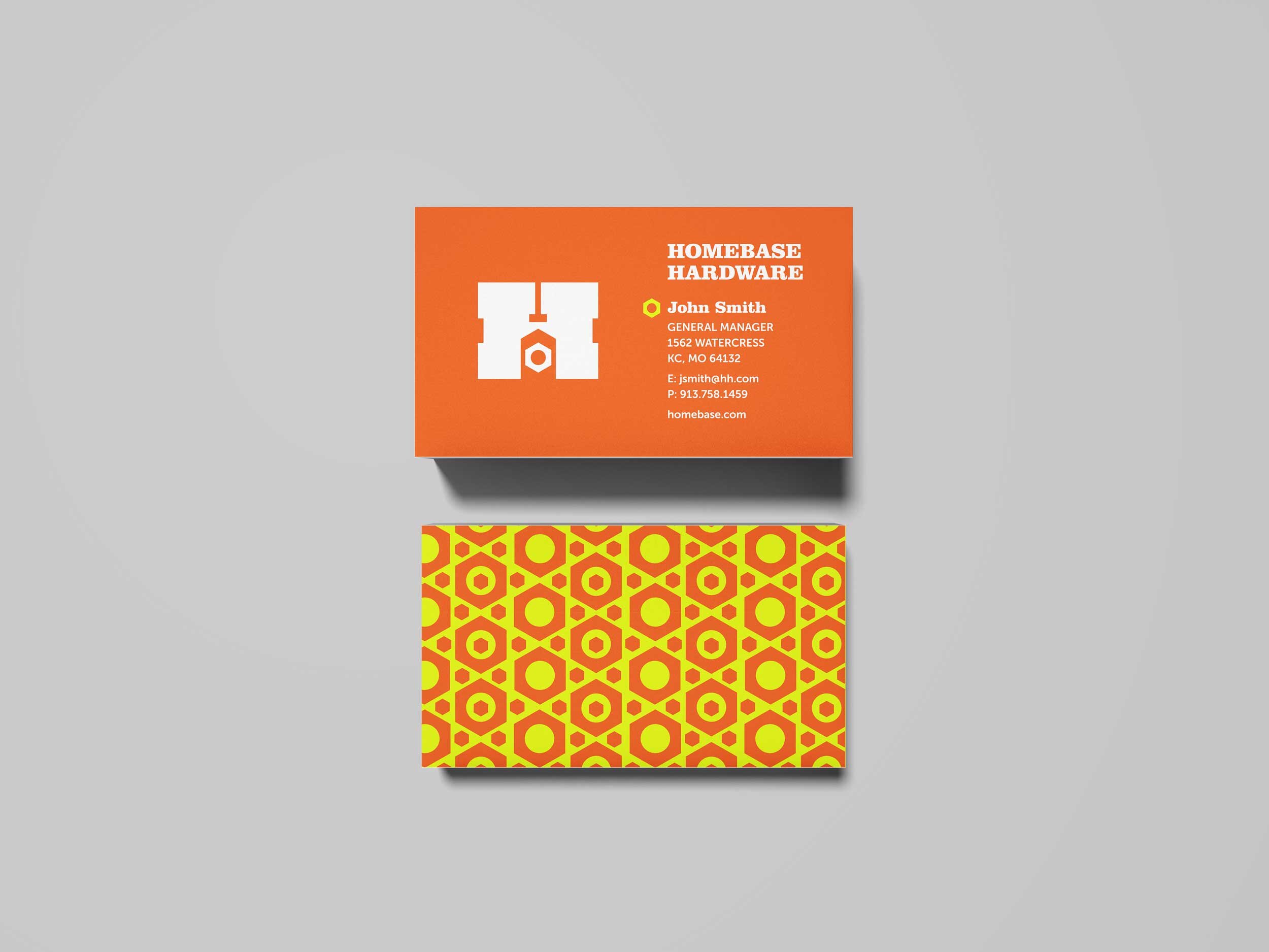
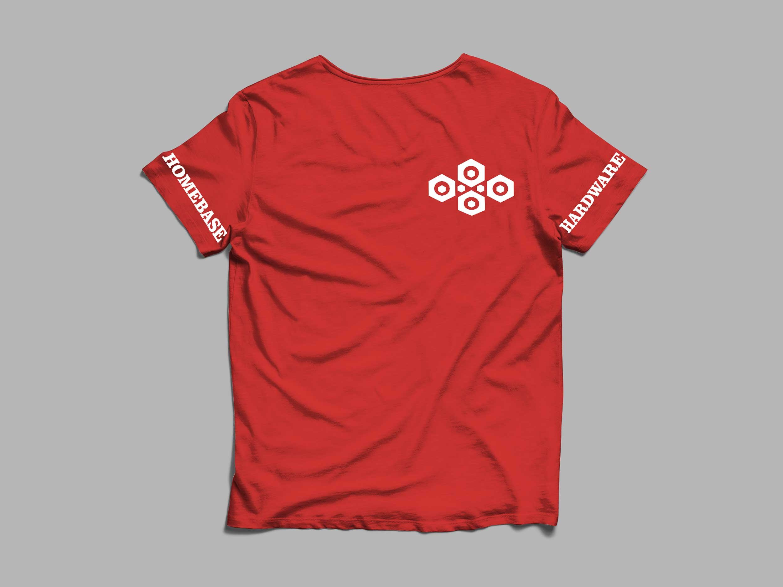
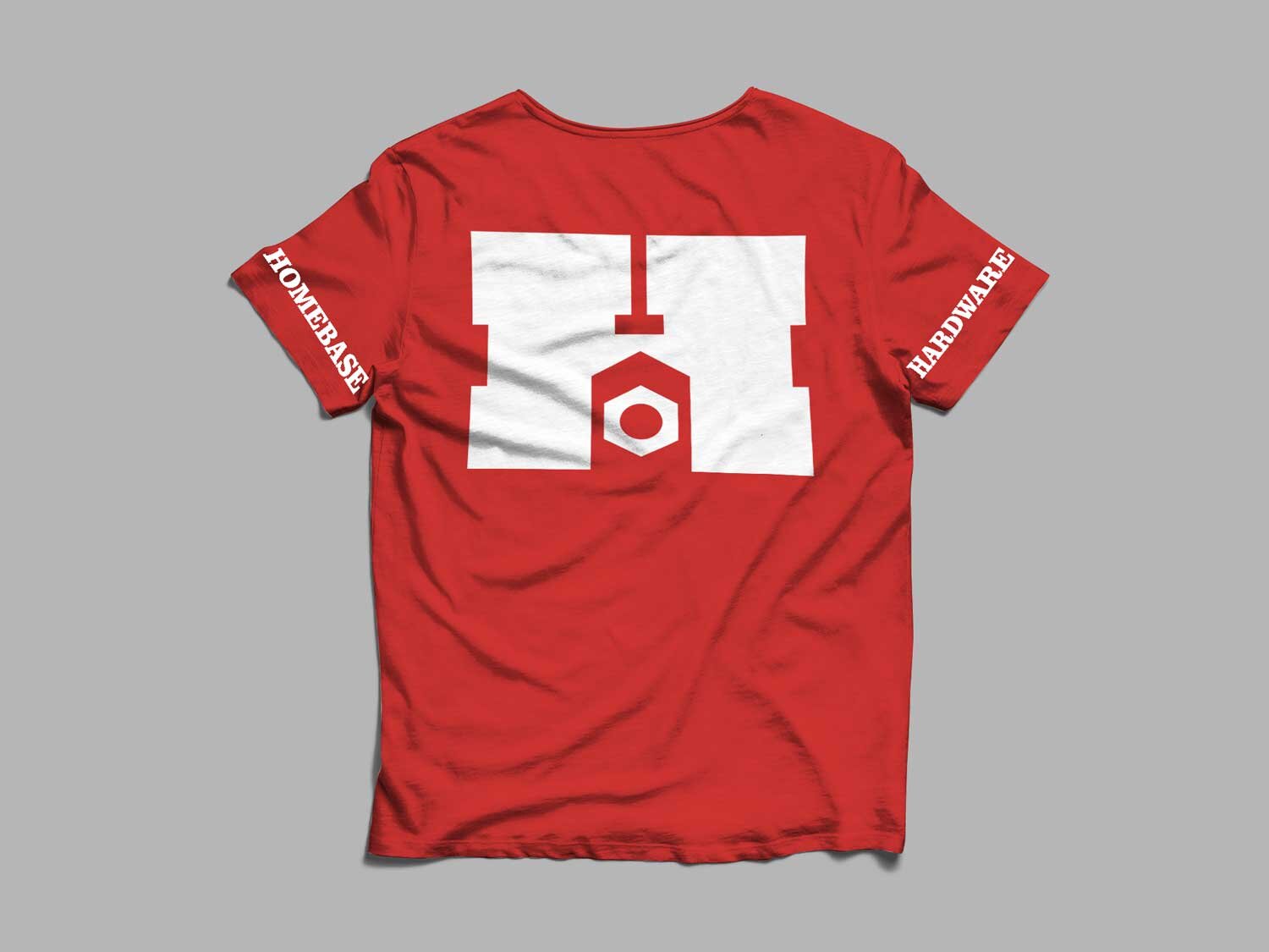
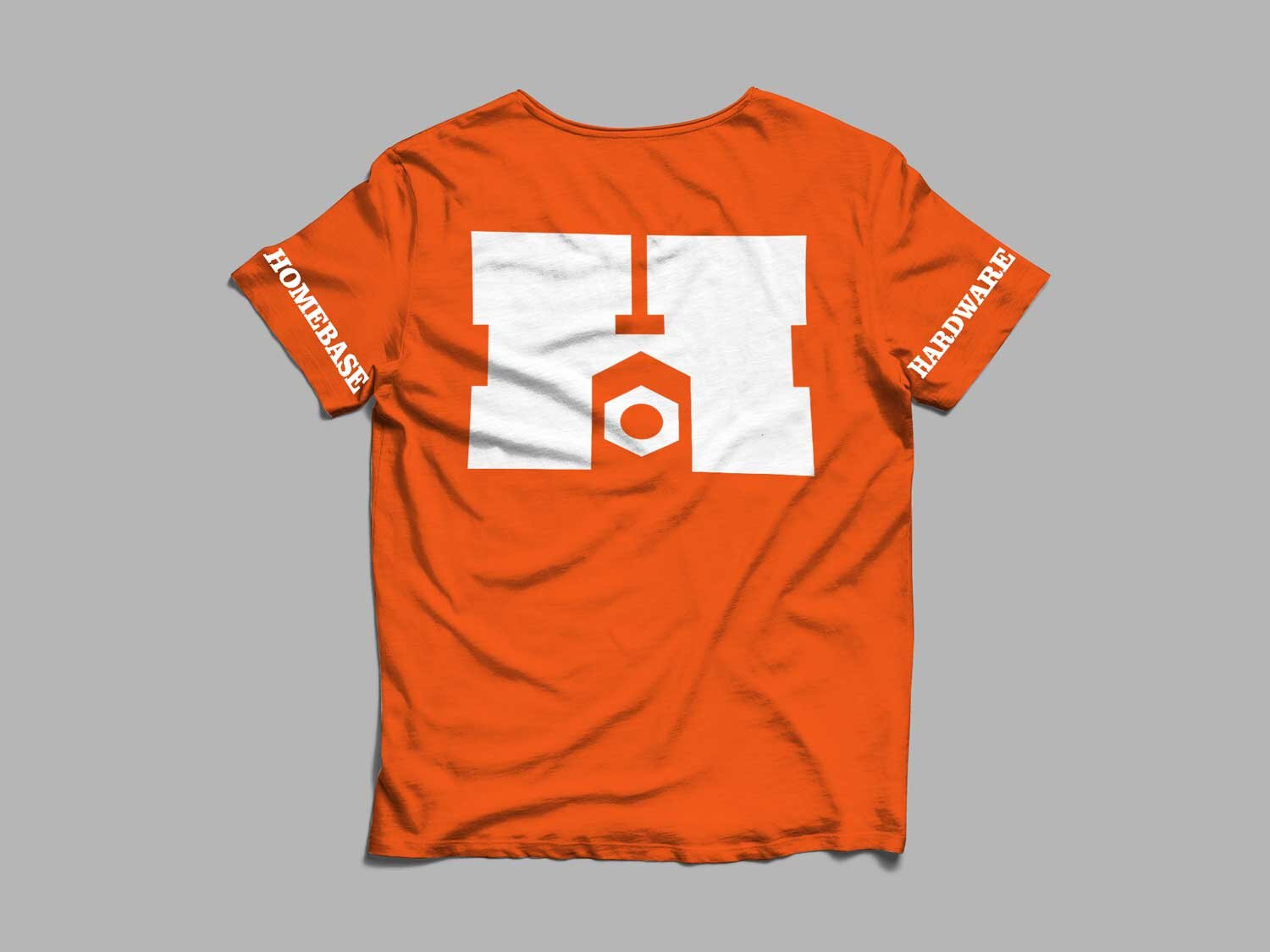
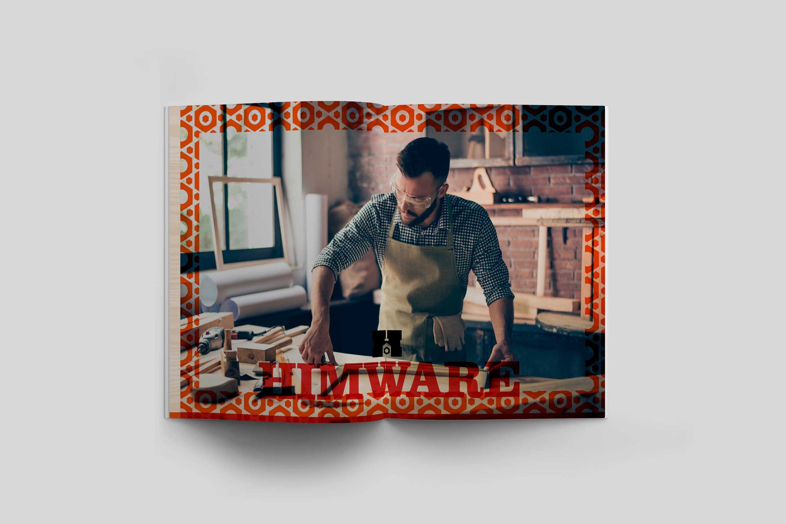
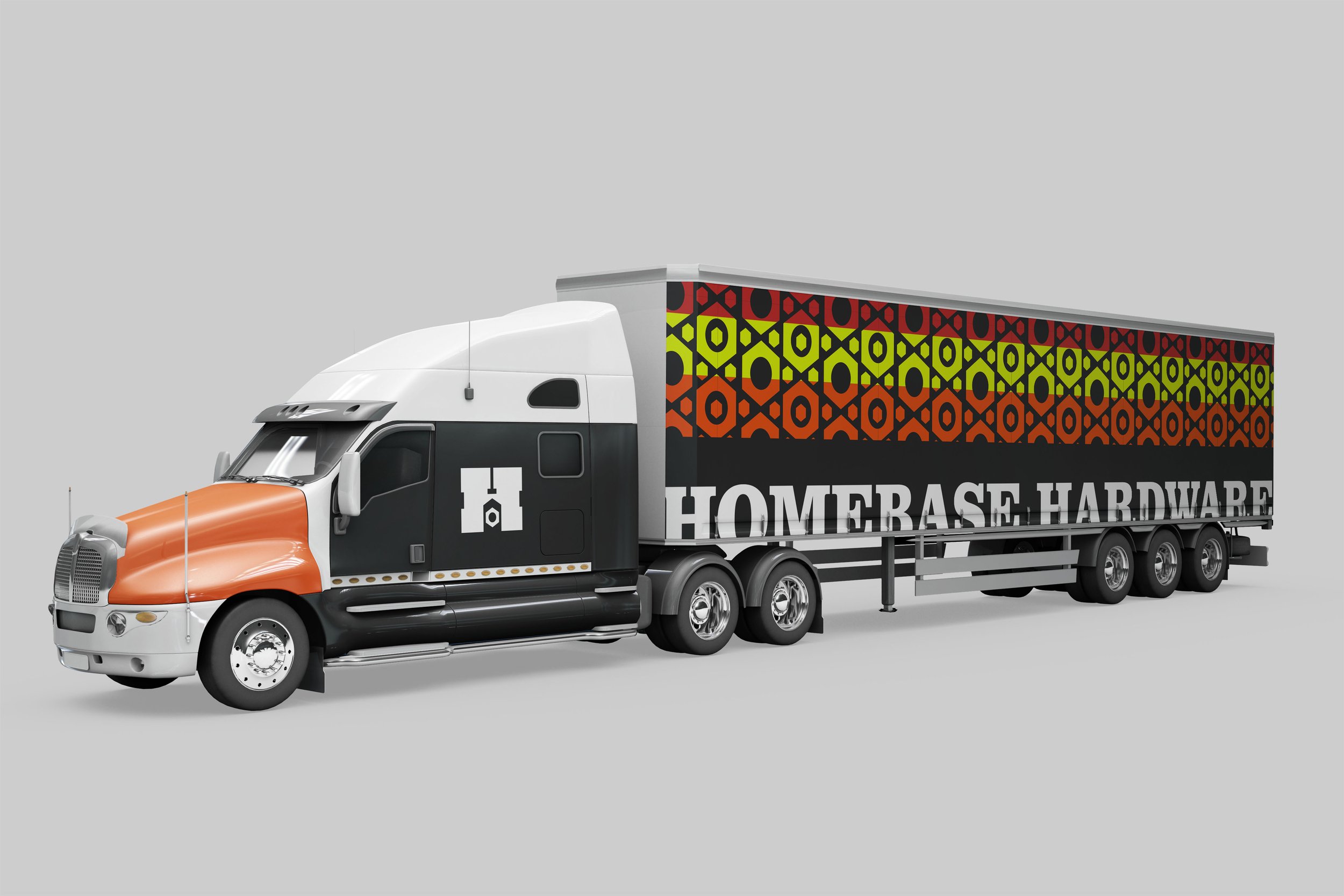
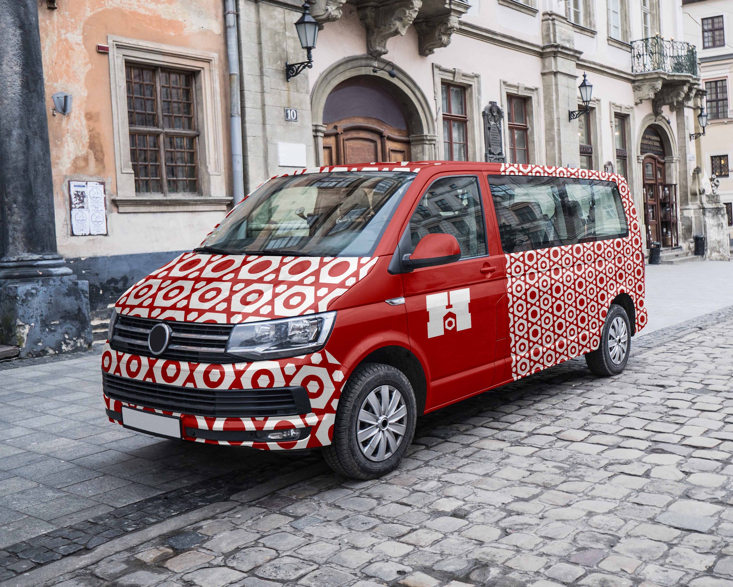
1) Once the audience and mood are established, the bulk of the identity will be grounded/complement the logo, and best to build it first. Wanting to imply strength, stability, and ultimate reliability, I developed a chunky slab serif in the form of a lettermark with negative forms of home and hardware at its center.
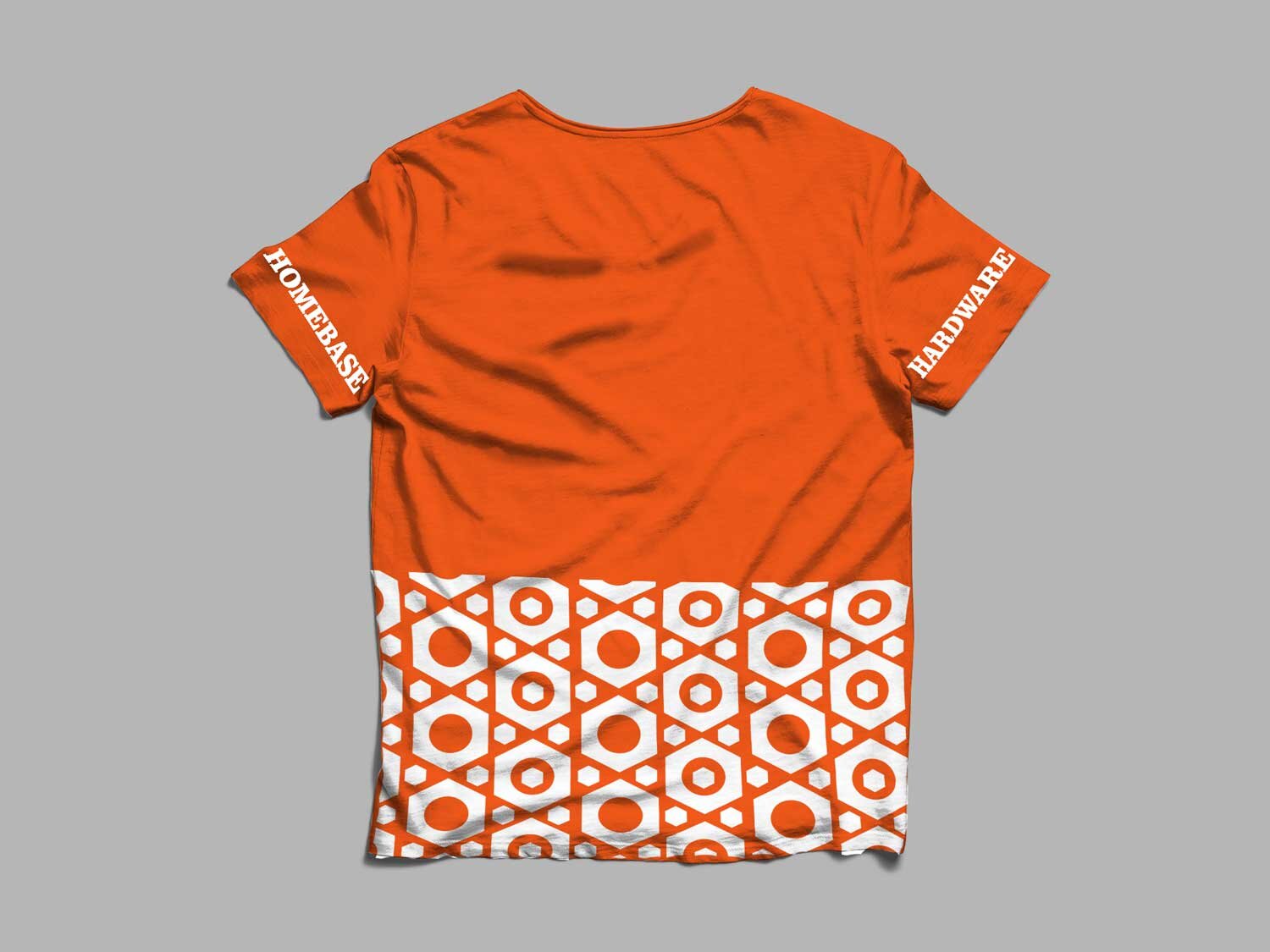
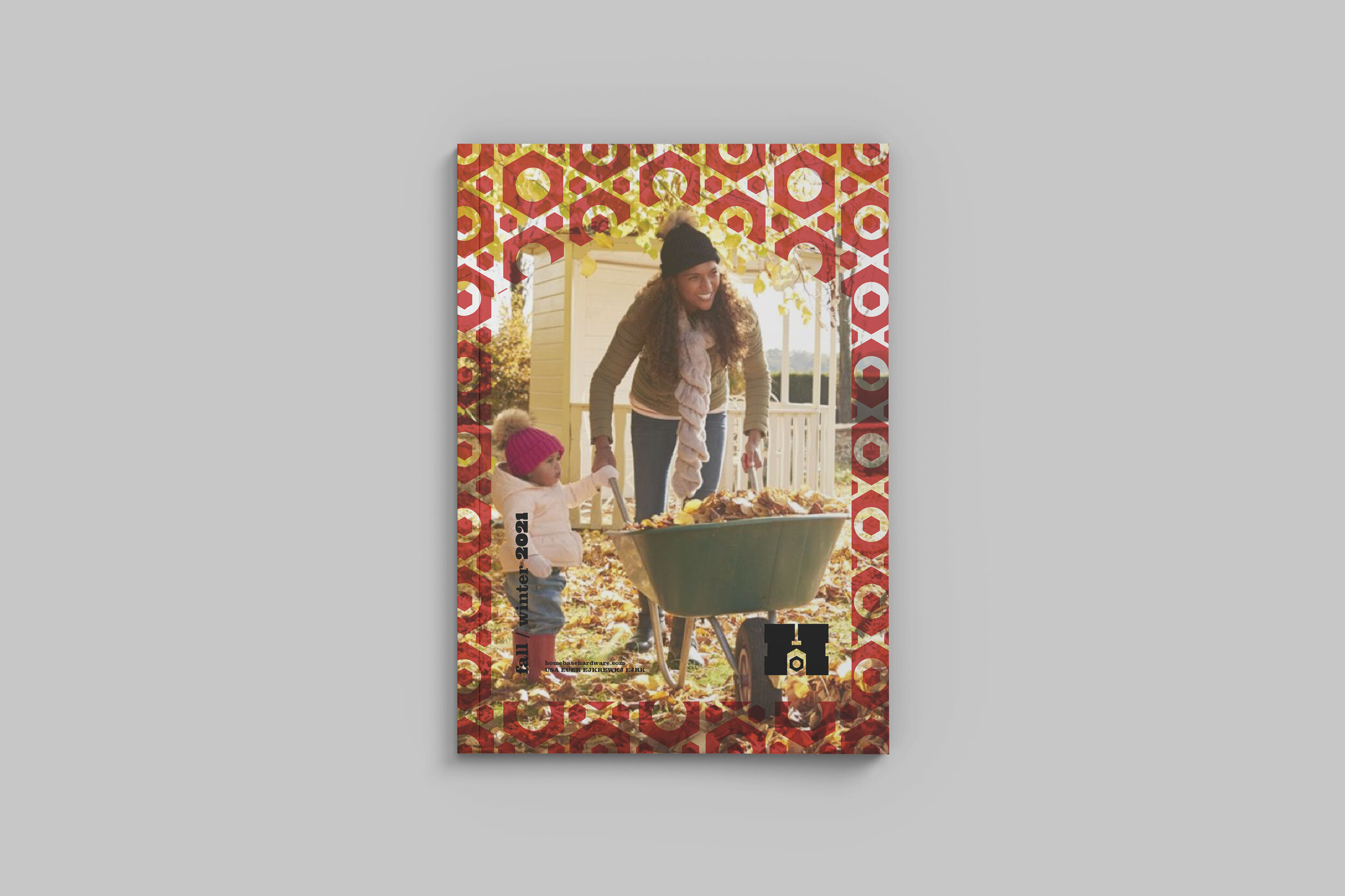
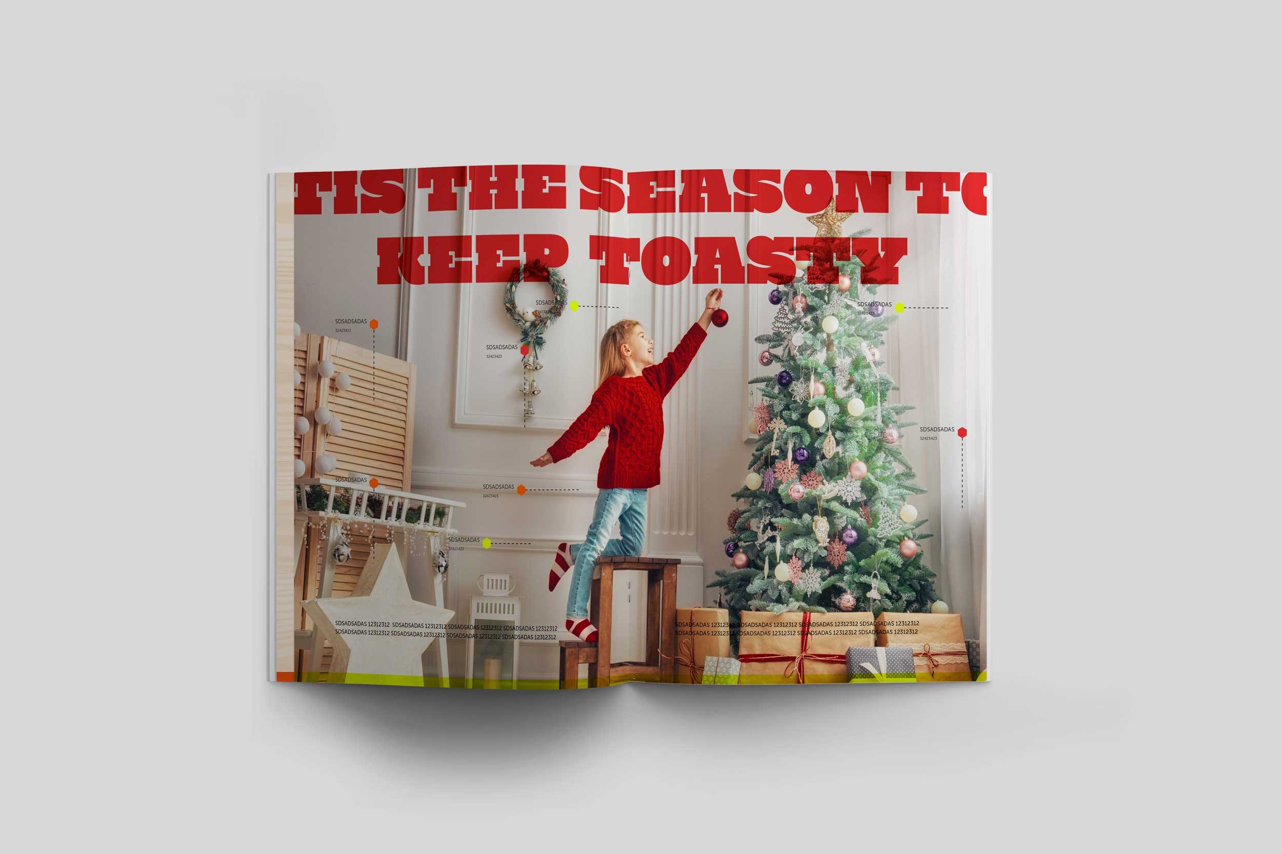
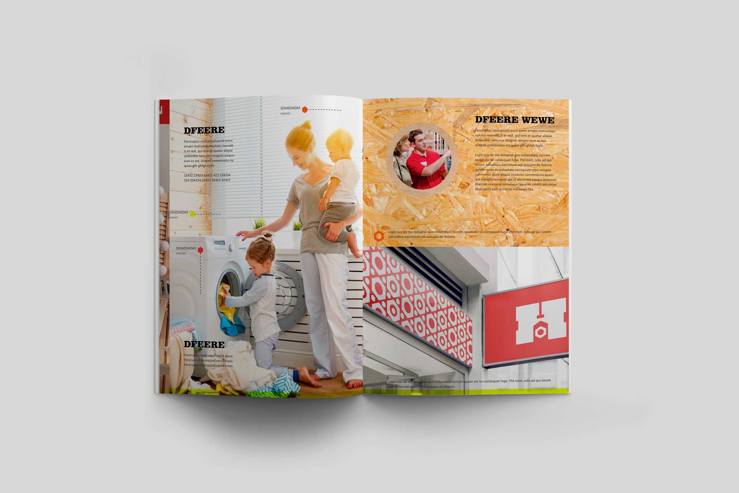
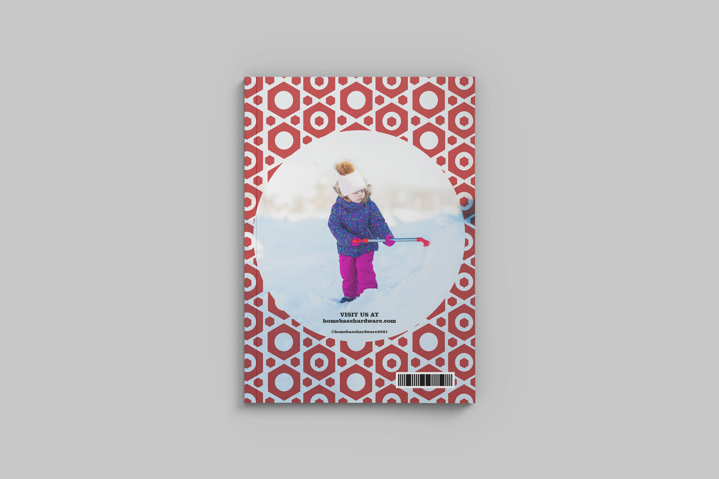
2) Next I considered the color palette, where recognizable hues in standard construction atmospheres came to mind (e.g. the red of stop signs/lights, the orange of construction sites, and the neon yellow of industrial uniforms).
Fortunately, all colors complement each other well and were supplemented with several grays, as well as a variety of textures like wood, brown paper, and a simple nut pattern because it was related to the logo and the most versatile shape. Because a lot of the original assets were designed for the fall/winter, I figured it'd also make sense to adapt the project to that season.
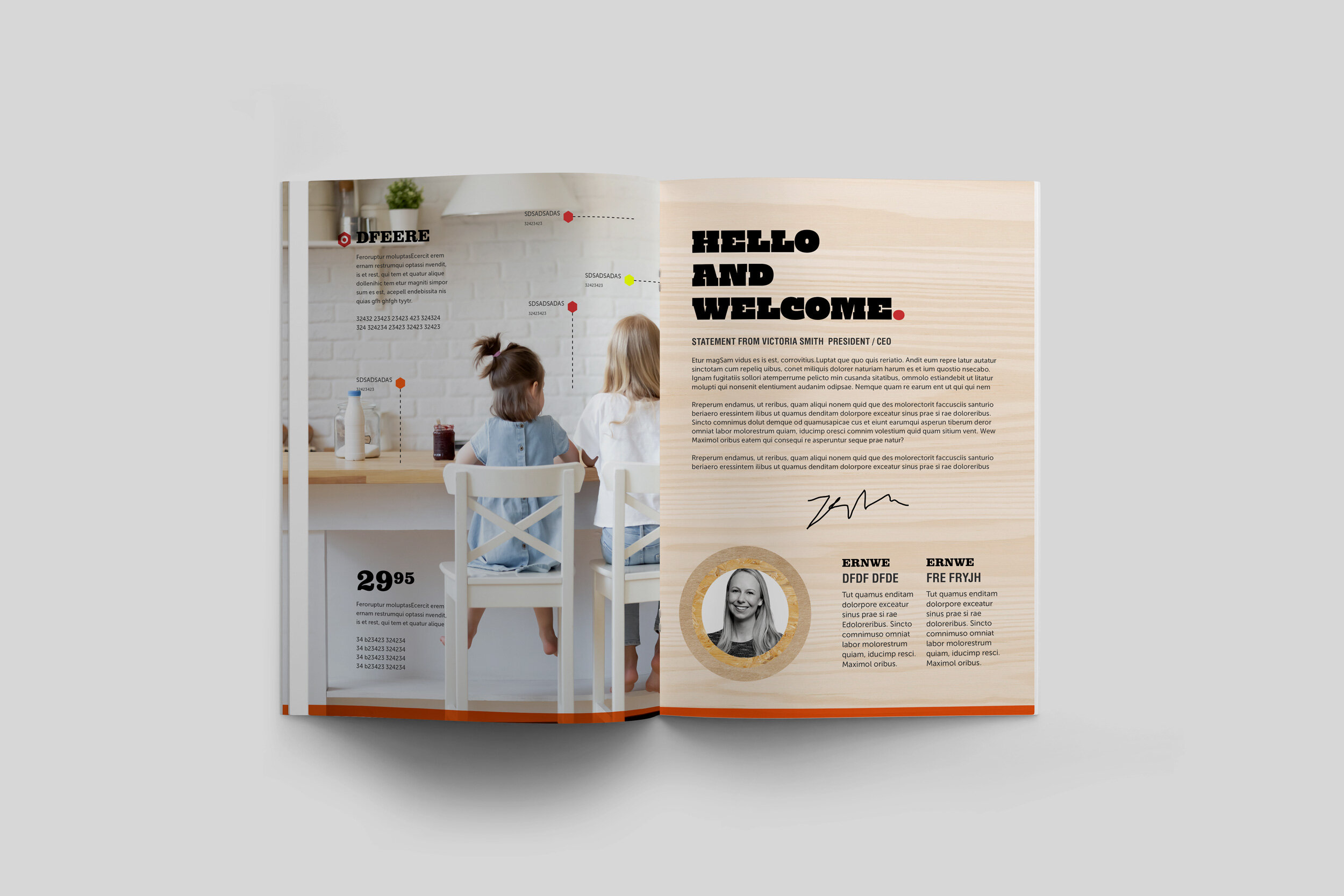
3) Given the business's signage and to confirm composition, I always brainstorm concepts/compositions with a series of sketches. Then it's a matter of prepping imagery/assets and implementing.