PERMISSION GRANTED
PROJECT
This identity project started when a friend requested a logo for his event-planning company called Permission Granted, where it was later revisited and expanded into a full visual identity system.
PROCESS
Although the owner's ideal audience was high income, he wanted to appeal to mid-range ages. I also noticed photos of former events seemed pretty casual. Given both these things, it made sense the identity of the company would not be sophisticated. However, it also wouldn't be so casual that it appealed to low-income audiences.
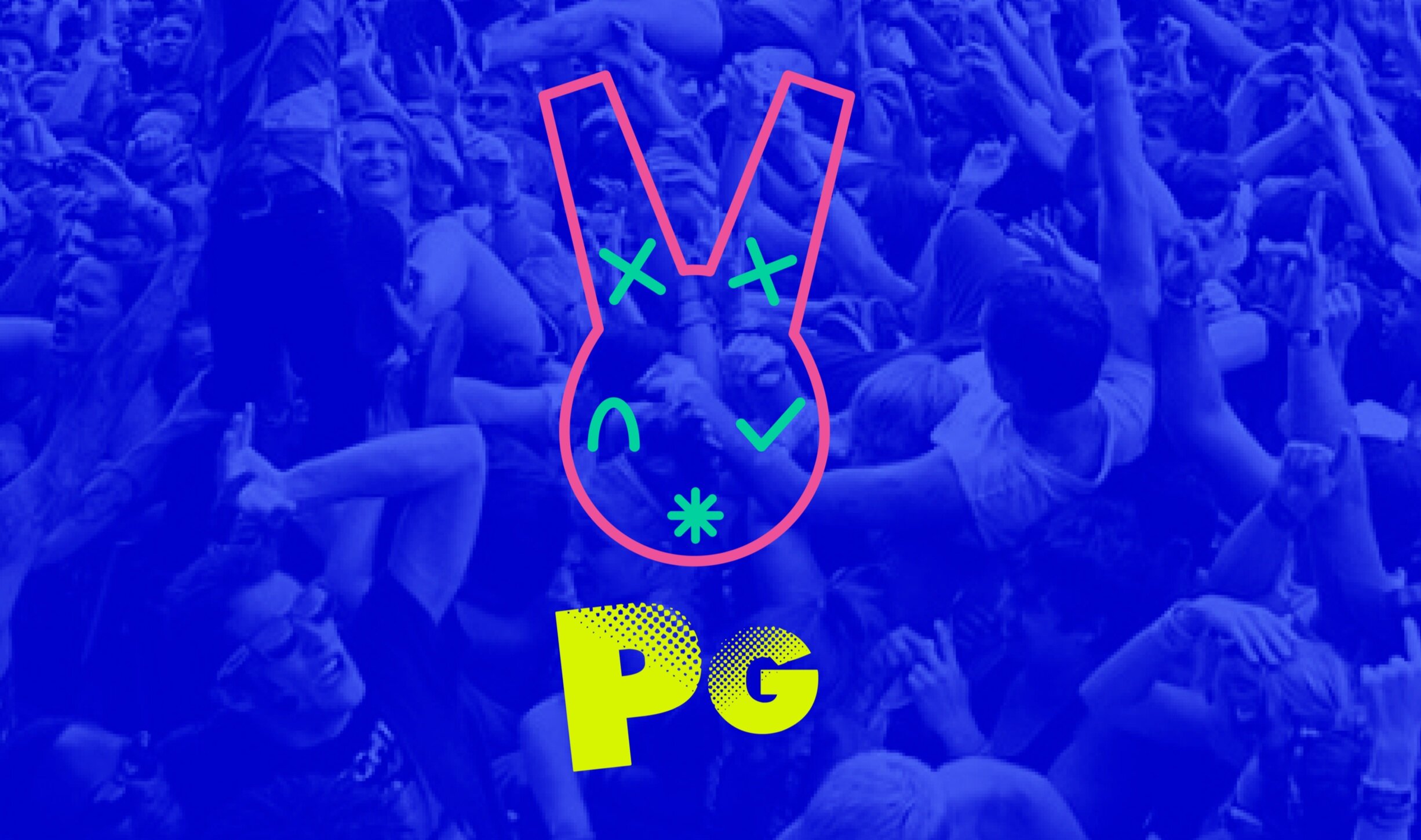
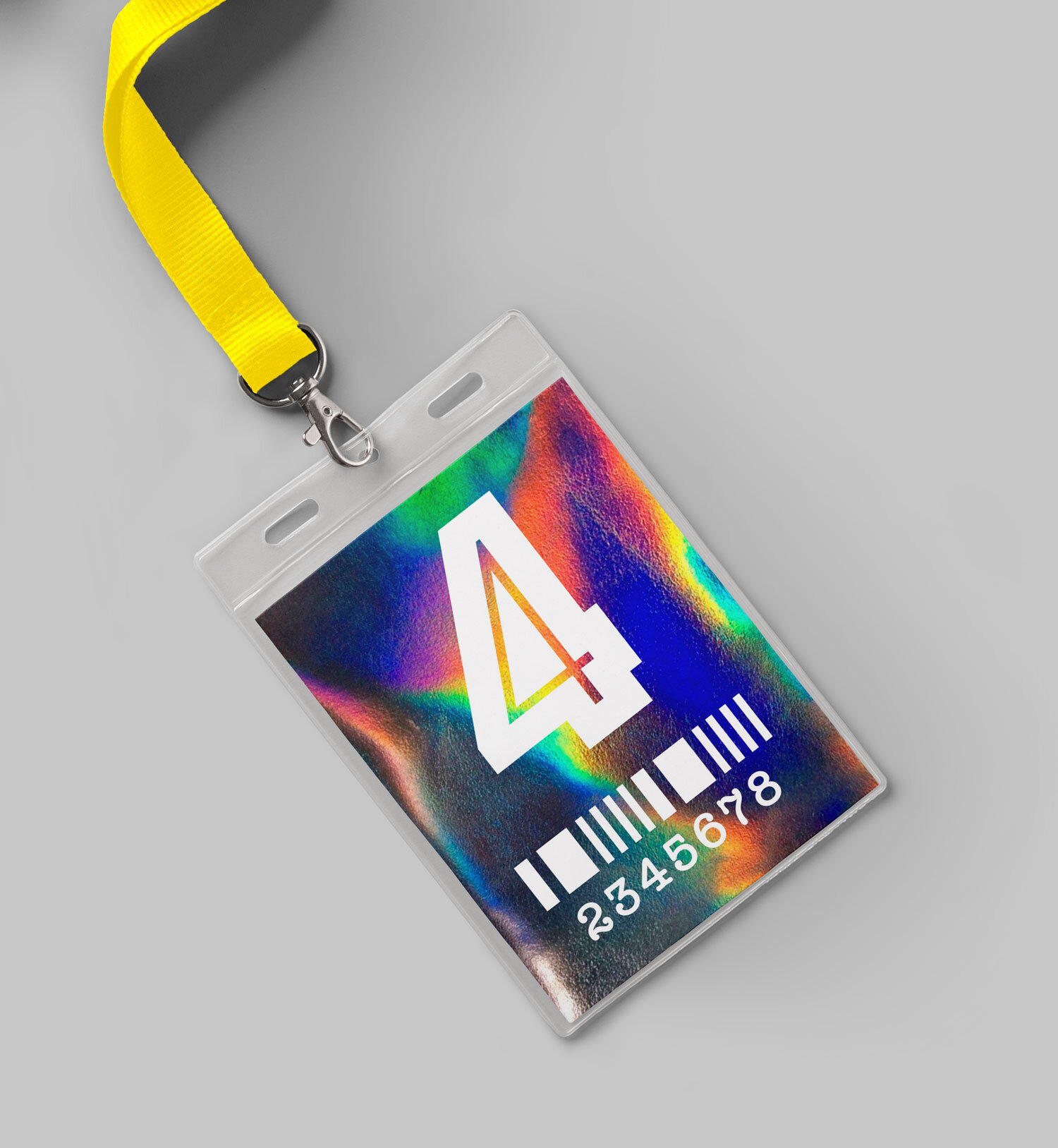
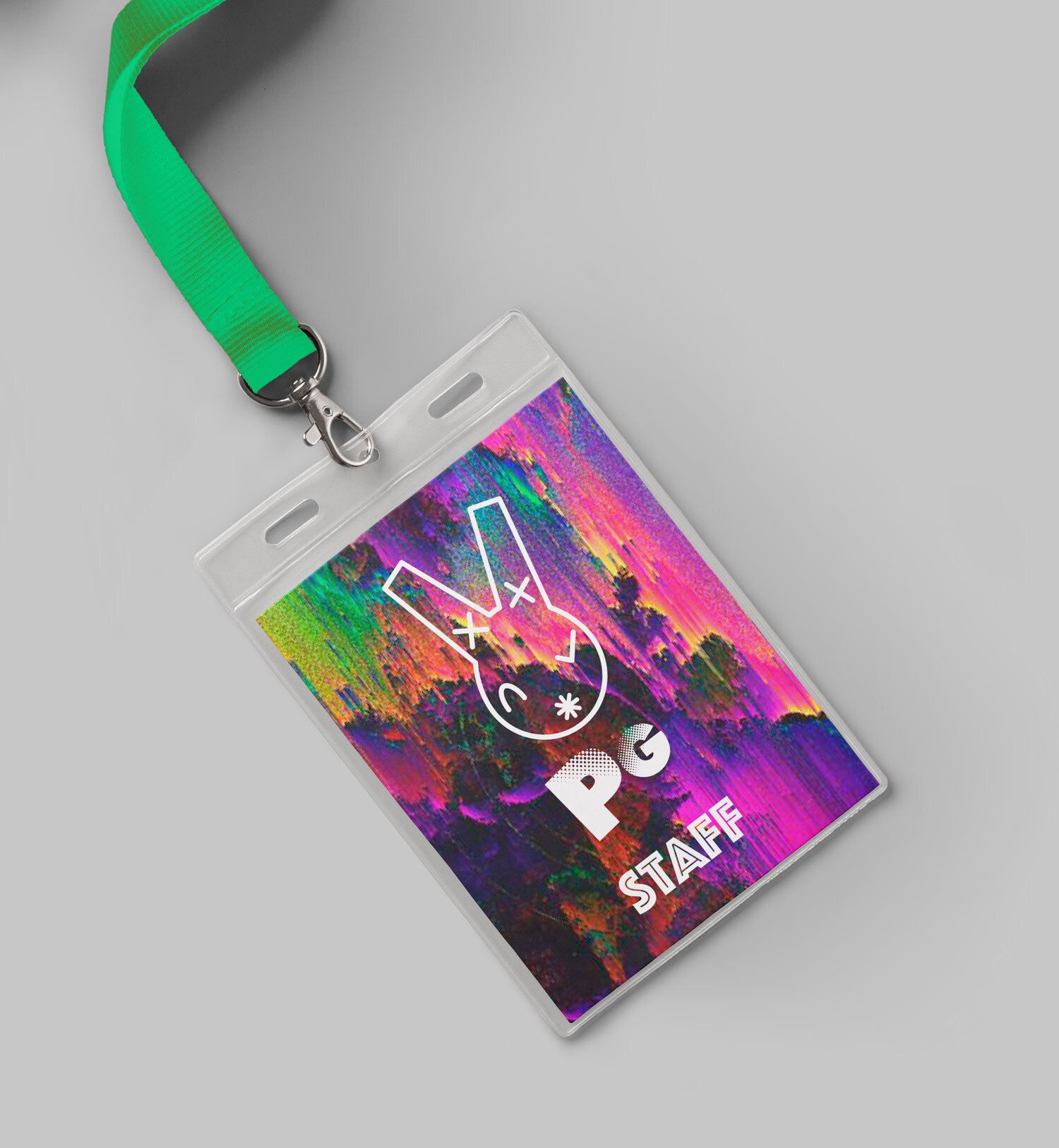
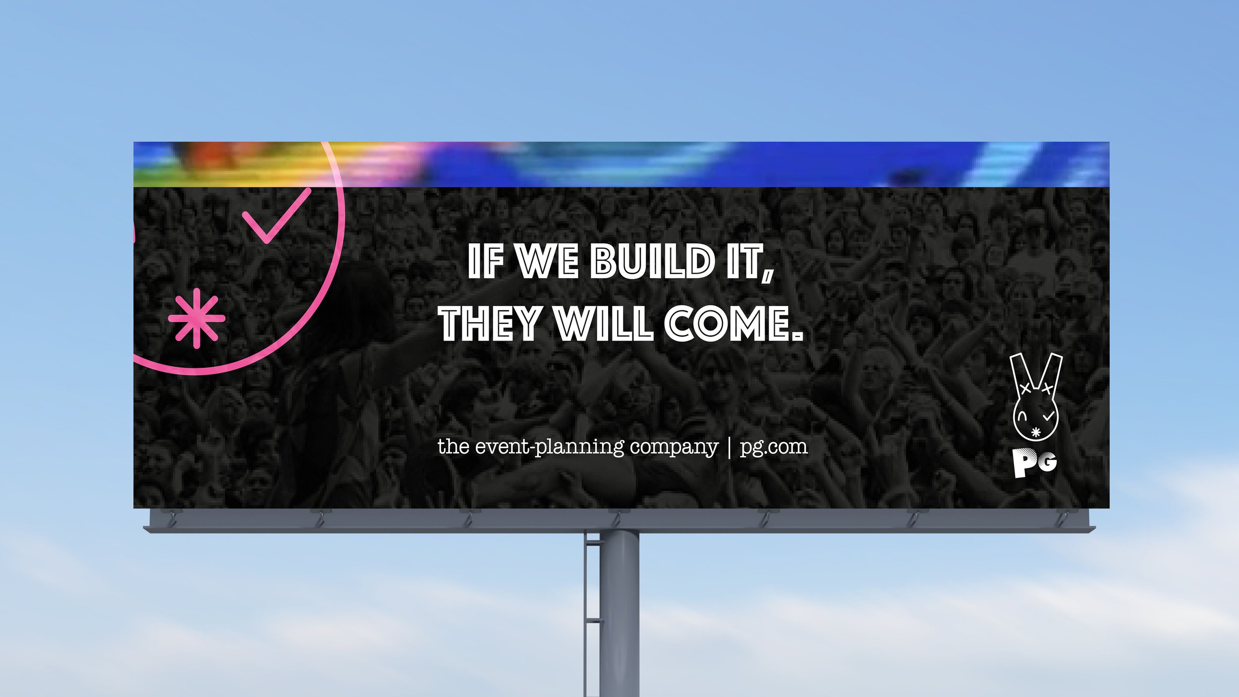
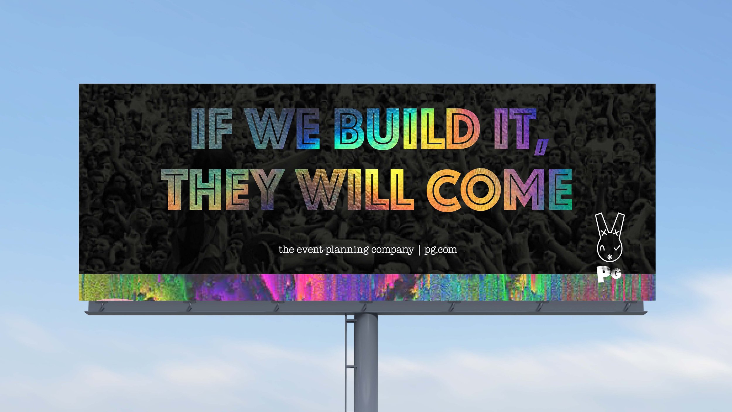
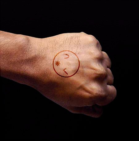
Three original logos were presented and based this identity on my favorite: a rabbit (associated with entering another world). The rabbit had X's (XX Roman numerals for 20 Mission/their original location) and asterisk’s details (associated with password entry). Aside from being otherworldly, another reason a rabbit appealed to me is a funky/subtle relation to rave culture, which also served as my mood inspiration.
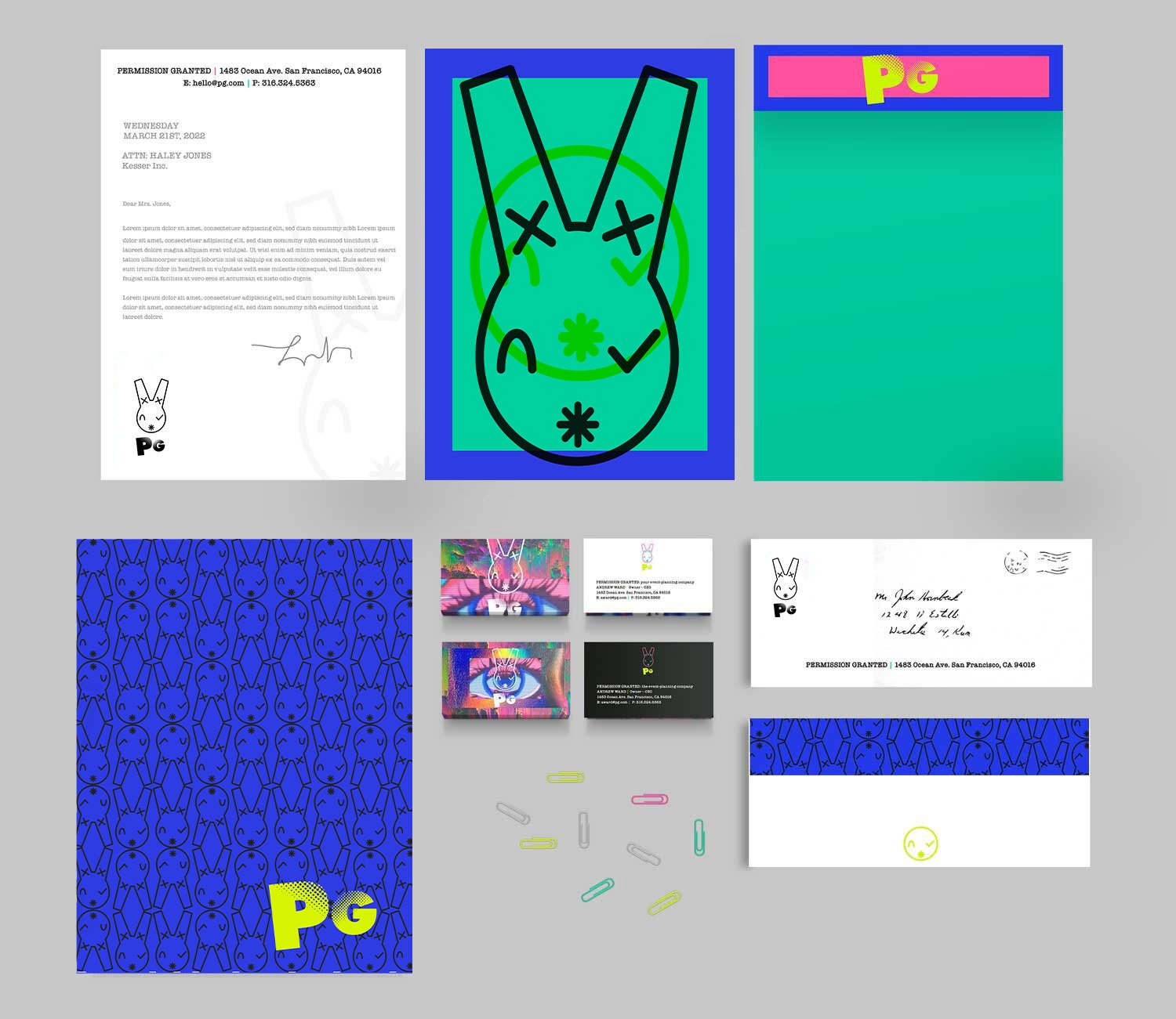
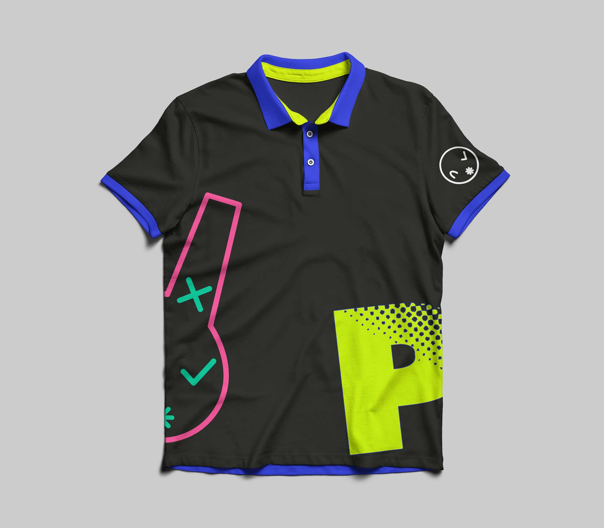
1) After the audience, logo, and mood/tone were established, I explored type, color, texture/patterns. Given the inspiration of night/rave life, as well brightness from the event photos, figured a bright, bold color palette made sense, alongside black/white neutrals to balance it.
2) Given the slightly casual/rough quality of mood, I choose several complementary typefaces inspired by zine magazines.
3) When choosing textures/patterns and considering the creative/unique but professional qualities I wanted to stress, I also decided on a digital eye graphic and dripping paint/holographic foil textures to accent.
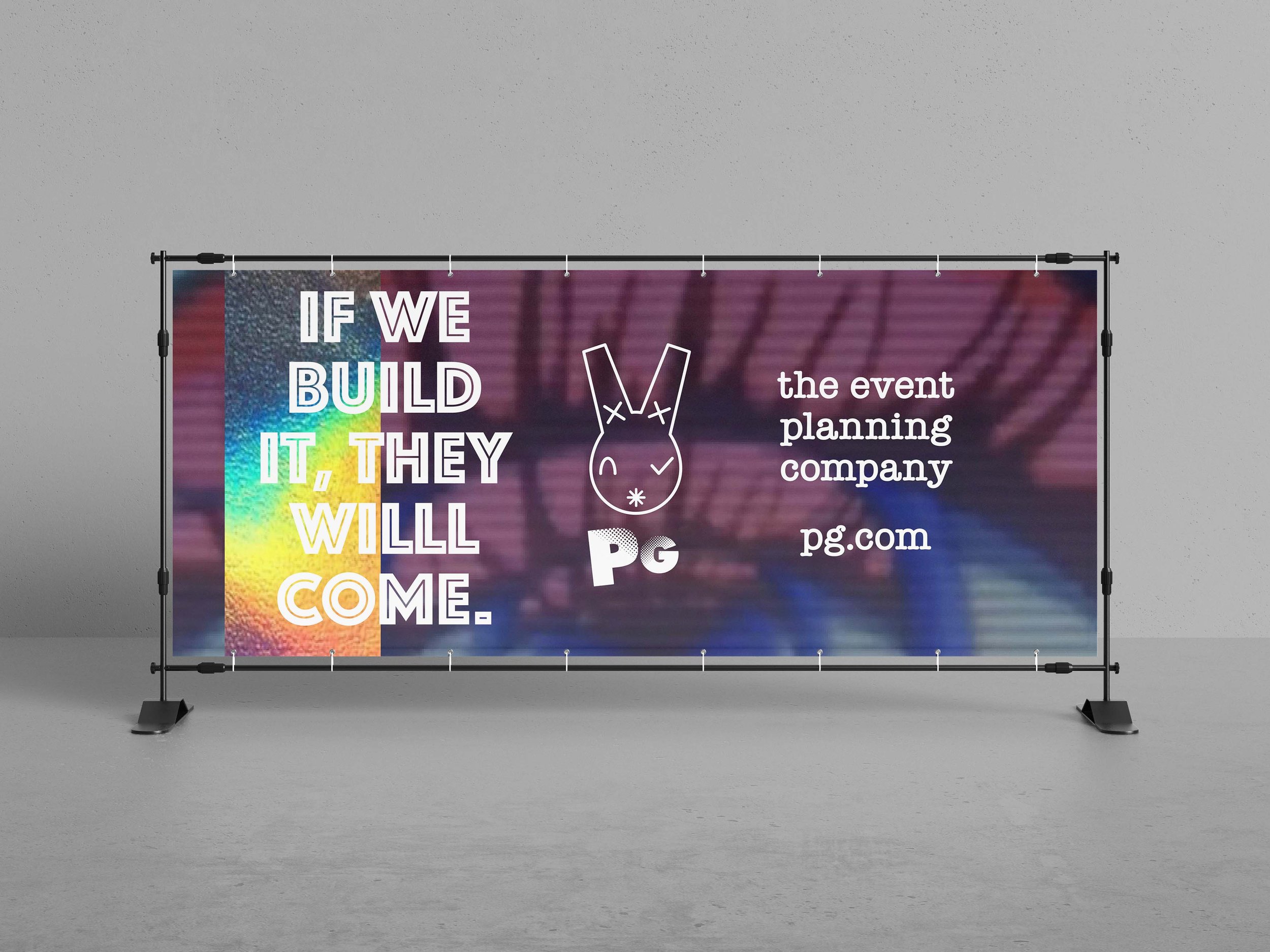
4) Finally sketched composites for all major mediums, refined and centered them on a crafty slogan.